Icons at the JAMA Network
Good things in small packages: JAMA Network visual abstract icons
Serena Williams. The Nike swoosh. The bald eagle.
What comes to mind when you think of the word "icon"? A tennis superstar, a ubiquitous consumer brand logo, a nation's official symbol?
You’d be right, of course. When we use the word icon around JAMA Network lately, it usually suggests those adorable line drawings on our visual abstracts that represent some of your favorite things, like catheters, IV bags, and dermatitis.
(If you're not familiar with visual abstracts, please visit this overview page. It's ok, we'll be here when you get back.)
What is an icon?
An icon can be defined as an emblem or symbol, a pictorial representation of a thing. We are all familiar with software icons, like the envelope, trash can, and folder. Icons are also important in wayfinding and signage–can you imagine being in an airport in a country whose language you don’t speak, trying to find the bathroom without them?
Icons need to be general enough so we don’t have to create a new one for each visual abstract. For instance, a torn meniscus and osteoarthritis of the knee could be represented by a single knee icon.
Of course, those conditions are completely different, but in the context of our visual abstracts, a simple knee icon is often all that’s needed to communicate the basic idea of knee condition.
Details make the design, but not too many details
Icons are an important part of the visual vocabulary used in visual abstracts. To keep everything consistent, we developed the following criteria to guide icon development:
Simplicity
When it comes to icons, the simpler the better. The viewer should almost be able to sight-read an icon, and so icons must be recognizable with as little detail as possible. Plus, they are small to begin with, so too much detail would make them unreadable blobs when viewed in context on Twitter, for instance.
Scale and size
Icons are created on a 72px square field— that’s just 1 square inch— to represent interventions, population, and conditions, and on a 32px square field for settings and locations. They are always used in the same size and never scaled up or down.
Line quality
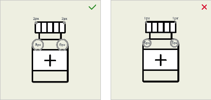
Icons use a consistent 2px line weight throughout. On a few unavoidable occasions, a narrower line weight can be added for a necessary detail. A rounded end cap is used for the ends of lines to keep everything looking friendly.
Angles and corners
Because we never know which icons will be used side by side, it’s important to use harmonious and consistent angles and corner radii. This helps to maintain the organized and structured look of the visual abstract layout.
Monochromatic color palette
Color is kept to black line only. White and tan are used when possible to create an illusion of solidity, and after many requests, light gray has recently been approved for use to add another level of differentiation.
Some do's and don'ts for visual abstract icons.
We strictly uphold these requirements for a few practical and aesthetic reasons: consistency, brand alignment, efficiency, and, importantly, visual elegance and sophistication.
The JAMA Network icon library has grown to include nearly 300 icons, from acne to radiography, and many things in between.
As you can imagine, it takes many talented people to complete a visual abstract. Manuscript editors, visual abstract editors, managing editors, production graphics, editorial graphics, designers, marketers, social media managers, administrators, and more—we all play a part.
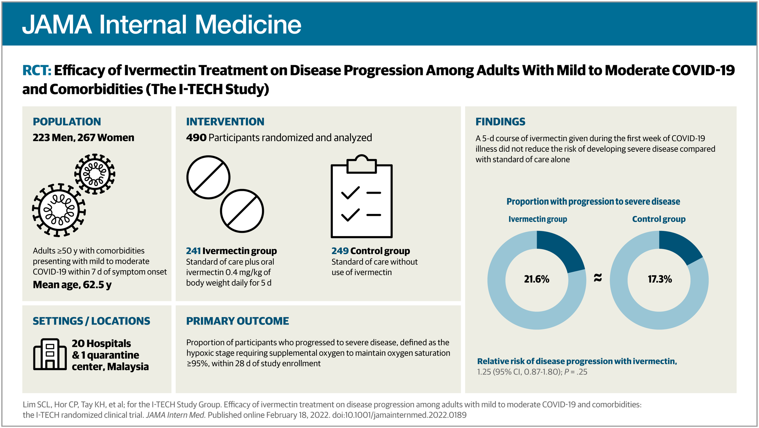
An example of a published JAMA Network visual abstract. For guidance on how to prepare figures for use in visual abstracts, please consult chapter 4.2.10 of the AMA Manual of Style.
Have thoughts or questions about this post? We'd love to hear from you. Send us a comment using the form below. Please include your name and your affiliation with your comment submission.


