When I was recently asked to give a presentation on forest plots at work, I was less than enthused. Figures are my least favorite part of a manuscript to edit because they usually require a lot of tedious work, and determining how to best visually present statistics makes my brain hurt. Forest plots in particular had become the subject of my nightmares leading up to the time of preparation of my presentation after a few experiences with editing unwieldy ones. However, thanks to being subjected to presenting on forest plots, I’ve gained some basic knowledge that I thought I would share.
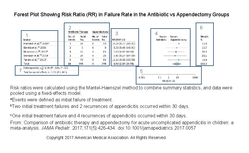
There are a few types of forest plots, namely those presenting the results of meta-analyses and those presenting subgroup analyses. Here, I will focus on a forest plot for a meta-analysis. In a meta-analysis, a forest plot acts as a visual representation of the results of the individual studies and the overall result of the analysis. It also shows overall effect estimates and study heterogeneity (ie, variation in results in the individual studies). A forest plot for ratio data should include the following data:
- The sources included in the meta-analysis, with citations. If the source author or study name is listed more than once, query the author to ensure that the study samples are unique; overlapping samples would lead to inaccurate estimates. Also, remember to renumber the references if you have renumbered them in the body of the article.
- The number of events and total number of participants in each group of the study and in the combined studies.
- Risk ratio and 95% CI for each study and overall.
- Graphed relative risk and 95% CI, with top labels describing what data markers on either side of the null line mean. The squares represent the results of each study and are centered on the point estimate, with the horizontal line in the center representing the 95% CI. The diamond shows the overall meta-analysis estimate, with the center representing the pooled estimate and the horizontal tips indicating the confidence limits.
- Log scale for the x axis with a label indicating the measure.
- Percentage of weight given to the study. Weights are given when pooled results are presented. Studies with narrower confidence intervals are weighted more heavily.
- Heterogeneity and data on overall effect.
(Open image in a new tab to see more detail.)
The caption should indicate the test and model (fixed or random effects) used in the evaluation and may include an explanation of the meaning of the different marker sizes.
If you follow these basic rules, forest plots are a breeze. —Sara M. Billings
I work with forest plots a lot.
Sara, I’m curious to know which software you use for editing them.