Icons at the JAMA Network

Nancy Essex, Director, Brand Design, JAMA Network

Good things in small packages: JAMA Network visual abstract icons

Serena Williams. The Nike swoosh. The bald eagle.

What comes to mind when you think of the word “icon”? A tennis superstar, a ubiquitous consumer brand logo, a nation’s official symbol?

You’d be right, of course. When we use the word icon around JAMA Network lately, it usually suggests those adorable line drawings on our visual abstracts that represent some of your favorite things, like catheters, IV bags, and dermatitis.


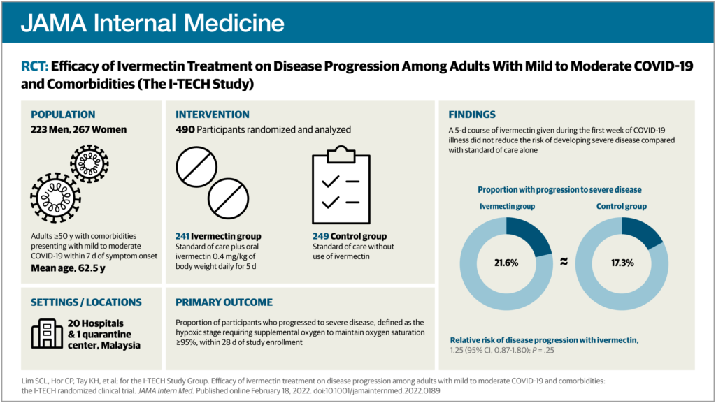
(If you’re not familiar with visual abstracts, please visit this overview page. It’s ok, we’ll be here when you get back.)

What is an icon?

An icon can be defined as an emblem or symbol, a pictorial representation of a thing. We are all familiar with software icons, like the envelope, trash can, and folder. Icons are also important in wayfinding and signage–can you imagine being in an airport in a country whose language you don’t speak, trying to find the bathroom without them?

Icons need to be general enough so we don’t have to create a new one for each visual abstract. For instance, a torn meniscus and osteoarthritis of the knee could be represented by a single knee icon.

Of course, those conditions are completely different, but in the context of our visual abstracts, a simple knee icon is often all that’s needed to communicate the basic idea of knee condition.

Details make the design, but not too many details

Icons are an important part of the visual vocabulary used in visual abstracts. To keep everything consistent, we developed the following criteria to guide icon development:

  • Simplicity
    • When it comes to icons, the simpler the better. The viewer should almost be able to sight-read an icon, and so icons must be recognizable with as little detail as possible. Plus, they are small to begin with, so too much detail would make them unreadable blobs when viewed in context on Twitter, for instance.
  • Scale and size
    • Icons are created on a 72px square field— that’s just 1 square inch— to represent interventions, population, and conditions, and on a 32px square field for settings and locations. They are always used in the same size and never scaled up or down.
  • Line quality
    • Icons use a consistent 2px line weight throughout. On a few unavoidable occasions, a narrower line weight can be added for a necessary detail. A rounded end cap is used for the ends of lines to keep everything looking friendly.
  • Angles and corners
    • Because we never know which icons will be used side by side, it’s important to use harmonious and consistent angles and corner radii. This helps to maintain the organized and structured look of the visual abstract layout.
  • Monochromatic color palette
    • Color is kept to black line only. White and tan are used when possible to create an illusion of solidity, and after many requests, light gray has recently been approved for use to add another level of differentiation.
Some do’s and don’ts for visual abstract icons.

We strictly uphold these requirements for a few practical and aesthetic reasons: consistency, brand alignment, efficiency, and, importantly, visual elegance and sophistication.

The JAMA Network icon library has grown to include nearly 300 icons, from acne to radiography, and many things in between.

As you can imagine, it takes many talented people to complete a visual abstract. Manuscript editors, visual abstract editors, managing editors, production graphics, editorial graphics, designers, marketers, social media managers, administrators, and more—we all play a part.

An example of a published JAMA Network visual abstract. For guidance on how to prepare figures for use in visual abstracts, please consult chapter 4.2.10 of the AMA Manual of Style.

Breaking It Down

When you pick up a book you haven’t yet read, do you immediately turn to page 1 and begin reading? Or, do you check out the front cover design to see if the book looks interesting? What about the back cover?

Most stories are broken down in many ways to hook the audience. It’s fairly standard that a book has a promotional blurb on the front cover, a tagline, a 1-sentence summary on the back, a slightly longer summary on the back, and, yes, more promotional blurbs on the back and inside the front cover. Perhaps you learned of the book through a social media post or through a review. What grabs your attention may not grab someone else’s, so breaking a story down in various ways makes it appeal to a larger audience.

The same can be done with scientific research articles. The main text typically follows the IMRAD format (introduction, methods, results, and discussion) to clearly and fully tell the story. The authors detail why they performed the research, how they did it and among whom, what they found, and what it means.

That story is condensed into an abstract, a brief summary that allows readers to determine whether they may find the full article interesting or useful. Should an abstract be too long or technical to pull a reader in, an article can have an even briefer key points section. This could be a bulleted list of important findings or, as in the JAMA Network journals, a list of the question, findings, and meaning of the research.

For social media, perhaps a single summary sentence is needed to fit the constraints of a character limit. For readers who prefer a more visual summary, especially through social media, a visual abstract can be useful. These are eye-catching depictions of the research, often using icons and very brief wording.

Twitter, JAMA (JAMA_current), January 17, 2020.

Medical editors may be tasked with reviewing, editing, or even writing some of these pieces. In doing so, a few tips might be helpful.

First, make sure the shorter piece is consistent with the main article. Numbers should match and any data in the shorter piece should be included in the main article.

Second, make sure the trimmed text doesn’t overstate the study’s results. For example, “This study suggests that X is associated with Y” is different from “X affects Y.”

Third, make sure the most important information is emphasized: “This [study type] examines [primary outcome] in [population].”

Fourth, remember the audience. The short items should be able to draw someone in to read the more technical information in the main article.

A journal article may be the culmination of an investigator’s life’s work or the end of a trial that has cost millions of dollars, which may make an article’s 1-sentence blurb seem measly. However, a patient may search social media to find information on a rare disease, and a post could bring the patient to the full article. A physician may scan key points to see if an article looks interesting enough to read fully. A student could review abstracts to find articles that are helpful for a research project. An investigator might use the full article to replicate the study or as a springboard for further research.

Each breakdown serves a purpose, promoting the right information to the right audience.–Shannon Sparenga