Looking Forward to the 11th Edition

At the most recent annual conference of the American Medical Writers Association, we received a sneak peek at some of the changes to come with the AMA Manual of Style 11th edition. AMA Manual of Style Committee Members Cheryl Iverson, Stacy Christiansen, and Annette Flanagin gave an overview of some highlights, including changes to the way references are styled, updates taking into account the growing presence of social media, and changes to nomenclature. Other topics included updates to corrections processes, clarification of authorship guidelines, and data sharing rules.

In this post, I thought I’d share some of the changes that I’m most excited about as an editor, many of which promise to make the editing process easier and more intuitive. Several new guidelines for styling references caught my attention. For example, electronic references in the current edition mirror traditional references with the addition of a URL in the middle of the reference and a date accessed at the end. The new edition will put URLs at the end of a reference, similar to how DOIs currently appear. Another welcome change is the omission of publisher locations from references to books and reports, which seems sensible given the multinational nature of publishing and the increasing move toward digital formats.

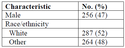
An update to the style of tables and figures was also covered in the presentation. Starting with the 11th edition, column heads in tables and axis labels in graphs will appear in sentence case capitalization rather than title case. Table and figure headings and labels in scientific publishing often contain a great deal of text, making it all the more important to display that text in a way that’s as easy as possible for readers to parse. In addition to saving space, the use of sentence case capitalization throughout figures and tables will make these elements appear more standardized and easier to read.

The new edition also makes some helpful distinctions between AMA style preference and alternatives considered acceptable. For example, it is now acceptable to use of “they” as a singular pronoun. In addition to circumstances in which “they” is a person’s preferred pronoun, this construction can also be helpful in preserving patient confidentiality (eg, avoiding the disclosure of patients’ sex in a small sample size to preserve anonymity).

Many other exciting changes are anticipated with the upcoming 11th edition. Stay tuned for more!—Heather Green


Get to the Point!

Here comes Hank. Too late, he’s spotted you, and now you’re in for another story—or rather, a litany of unnecessary details. “I said this, and she said that, and then I said, ‘Really!’” Hank never edits himself; he simply tells you E-V-E-R-Y-T-H-I-N-G until you’re screaming inwardly, “Get to the point!”

While editing manuscripts, I periodically encounter a “Hank” author. Every tidbit of information is important and, in his view, absolutely necessary. Along with his manuscript, which includes the maximum-allowed 5 tables and/or figures, he provides a Supplement that comprises 3 eMethods sections, an eResults, 14 eTables, and 9 eFigures. Data, data, and more data, until the Supplement resembles a closet stuffed by an 8-year-old who was told to clean her room. Everything. It’s all in there.

Consider the busy physician-reader. After perusing the array of freshly published articles in the journal website’s New Online section, she may click on Hank’s title and see that long list of supplemental material populating the scholar’s margin. However transparent the author endeavored to be by providing so much information, she doesn’t have time to read it all now; she needs summaries.

AMA style advocates that “tables and figures demonstrate relationships among data and other types of information” and that “a figure should be used if the relationships are complex….Like a paragraph, each…figure should be cohesive and focused.”

With that reader in mind, the manuscript editor reformats the author’s originally supplied figures to journal style and hones each one to present the material clearly. No chartjunk, no extraneous elements, no distracting line treatments.

Flow diagrams show the numerical progression of patients through the study: the number screened for inclusion, the number excluded for these reasons, the number enrolled, and the number at each stage, with those excluded or lost to follow-up at each stage also accounted for. The last box shows how many patients made it to the end of the study or were included in the primary analysis. From top to bottom, the progression of numbers makes perfect arithmetic sense.

Figures of multiple clinical, radiologic, or histologic images are labeled to guide the reader: before surgery, 6 months after surgery, 2 years later; magnetic resonance images of brains from patients 1 and 4; or specimens from a healthy individual and a patient with disease preceding another from the patient 1 year after treatment.

Graphs are appropriate to the data presented: bars for frequencies, data markers and error bars for summary data, forest plots for meta-analyses. All axes and ticks are clearly labeled, curves are identified by direct labeling or by the inclusion of concise figure keys, and bars and data markers are a solid color for the patients who received treatment and without color for those who received placebo. The numbers of patients at risk at each time point lend additional meaning to Kaplan-Meier survival curves. Forest plots include numerical data in addition to the illustrated plot points, with labels on either side of the graph’s vertical line at 1.0 to indicate whether each data marker’s location favored treatment or no treatment.

Back to our reader. Time is short, so she starts with the abstract. Words are read quickly, their meaning filtered through her years of accumulated knowledge and absorbed. She takes in the tables next. Row upon row of data; numbers represent baseline characteristics, laboratory results, and statistical analysis. Again, the numbers are filtered for meaning and digested for information that can help the reader treat her own patients. She studies the figures, and their meaning is immediately apparent: the bar for affected patients from one age group is taller, a survival curve is higher and longer for patients who received the lower dosage, the difference between 2 clinical images before and after treatment is obvious. No filter needed. Instantly clear. Results from years of the author’s research are visually summarized, seen by the reader, grasped, and understood.

The Supplement stands ready for closer investigation, but first the point must not be obscured. State it—illustrate it—clearly.—Connie Manno, ELS


Have You Talked to Your Tables About the Dangers of Sex Bias?

The problem of bias is well documented in the biosciences. Even since the Health Revitalization Act of 1993, which laid out guidelines intended to ensure more equitable representation of women and minorities in federally funded scientific research, the problem persists. A 2010 study published in The Journal of Women’s Health found that, among 46 clinical studies enrolling both sexes, women comprised on average 37% of the participants, and among 69 studies, 87% did not conduct analyses by race or ethnicity, and 18% did not report differences in the racial makeup of the study sample at all. Examples of this sort abound and, setting aside the pernicious sociohistorical and nuanced biologic reasons for this phenomenon, the resulting reality is that medicine, as applied to women and minorities, is less evidence based because most research is extrapolated from a homogeneous population—white men.

But even as we attempt to resolve these problems—ensuring that guidelines are in place and that they are followed when conducting new research—there is another, more subtle way that these biases creep into the biomedical literature. Even if the study itself was conducted using a diverse population of participants, sometimes the reporting elides this fact.  As a manuscript editor I have encountered this problem more often than one would expect, and the culprit is usually the table.

In this table, as in many tables that I have encountered, “white” and “male” are the default. Women’s bodies and the bodies of racial and ethnic minorities are implied by the number of white male bodies present.

A good rule when presenting data in tables is to make sure that when you are reporting the sex of participants, if you choose to report only 1 sex, choose the sex that constitutes the majority of the sample. When reporting on racial and ethnic differences, be as specific as possible (even if these comprise a small percentage of participants). Who are the “others?”

The current edition of the AMA Manual of Style does not explicitly lay out these precautions, but in chapter 4, section 1, you will notice that every example shown for presenting data in tables follows these guidelines.

This is not merely a problem of “political correctness” or social equity—it is a question of accurate reporting and just plain good science.—Gabriel Dietz


Forest Plots: The Basics

When I was recently asked to give a presentation on forest plots at work, I was less than enthused. Figures are my least favorite part of a manuscript to edit because they usually require a lot of tedious work, and determining how to best visually present statistics makes my brain hurt. Forest plots in particular had become the subject of my nightmares leading up to the time of preparation of my presentation after a few experiences with editing unwieldy ones. However, thanks to being subjected to presenting on forest plots, I’ve gained some basic knowledge that I thought I would share.

There are a few types of forest plots, namely those presenting the results of meta-analyses and those presenting subgroup analyses. Here, I will focus on a forest plot for a meta-analysis. In a meta-analysis, a forest plot acts as a visual representation of the results of the individual studies and the overall result of the analysis. It also shows overall effect estimates and study heterogeneity (ie, variation in results in the individual studies). A forest plot for ratio data should include the following data:

  1. The sources included in the meta-analysis, with citations. If the source author or study name is listed more than once, query the author to ensure that the study samples are unique; overlapping samples would lead to inaccurate estimates. Also, remember to renumber the references if you have renumbered them in the body of the article.
  2. The number of events and total number of participants in each group of the study and in the combined studies.
  3. Risk ratio and 95% CI for each study and overall.
  4. Graphed relative risk and 95% CI, with top labels describing what data markers on either side of the null line mean. The squares represent the results of each study and are centered on the point estimate, with the horizontal line in the center representing the 95% CI. The diamond shows the overall meta-analysis estimate, with the center representing the pooled estimate and the horizontal tips indicating the confidence limits.
  5. Log scale for the x axis with a label indicating the measure.
  6. Percentage of weight given to the study. Weights are given when pooled results are presented. Studies with narrower confidence intervals are weighted more heavily.
  7. Heterogeneity and data on overall effect.

(Open image in a new tab to see more detail.)

The caption should indicate the test and model (fixed or random effects) used in the evaluation and may include an explanation of the meaning of the different marker sizes.

If you follow these basic rules, forest plots are a breeze. —Sara M. Billings


Questions From Users of the Manual

Q: How should columns with mixed units of measure indicate the unit of measure?

A: In a table with mixed units throughout, use a table footnote for the most common unit of measure, eg, “Unless otherwise indicated, data are expressed as number (percentage).” and specify in the stub or column head only those units that are different. In a table with mixed units in a single column, use the most common unit in the column head and only provide another unit in the table cell for those entries that have a different unit of measure.

Q: Because of the change from the 9th to the 10th edition in the way number and percentage are handled in running text (see page 832 in the 10th edition), should column headings in tables also be changed to read, for example, “No. of Girls (%)” rather than “No. (%) of Girls”?

A: No. The style “No. (%) of Girls” is still an acceptable table column head as here both “number” and “percentage” apply to “of girls,” whereas in the example on p 832, the percentage is given as more of an aside to the numerator and denominator and hence follows: “Death occurred in 6 of 200 patients (3%).”

Q: What recommendations do you have for the preferred typeface of a punctuation mark that follows copy set in something other than roman type?

A: Some specific recommendations are outlined below:

• If an entire sentence is set in a typeface other than roman (eg, italic, bold), any punctuation in that sentence would take the typeface of the rest of the sentence.

• If part of a sentence is set in a typeface other than roman, even if it’s the end of the sentence, the ending punctuation would be roman.

• For heads, sideheads, entries in a glossary, the punctuation would follow that of the preceding word (so, in Correct and Preferred Usage of Common Words and Phrases, the commas between the word pairs are boldface, like the words).

• For parentheses and brackets, unless the entire sentence is set in a typeface other than roman, the parentheses or brackets are roman (see the example with “[sic]” on p 358).—Cheryl Iverson, MA


Questions From Users of the Manual

Q: If there is a column for P values in a table and if a P value “straddles” rows (eg, provides the P value for men vs women), how should this be shown?

A: There are several options, with option 1 being preferred:

1. Center the P value between the items it compares (eg, between the values for men and women) and consider the use of a side brace.

2. If only 2 items are being compared, list the P value on the line giving the overall category (eg, Sex).

3. Use footnotes to indicate the P value for items being compared (eg, use a superscript “a” next to the value for men and the value for women and indicate the P value for this comparison in a footnote labeled “a”).

Q: If some of the confidence intervals given in a table column include negative values, how do you combine the minus sign and the hyphen that would normally be used in such a range in a table?

A: With ranges that include a minus sign, use to to express the range, rather than a hyphen. Carry this style throughout the entire table, even for those values that do not include a minus sign.—Cheryl Iverson, MA

Questions from Users of the Manual

Q: I’ve been searching the 10th edition to see where the list of footnote symbols from the previous edition is given and I cannot find it. Is that because the lowercase alphabet letters are now going to replace these symbols, as mentioned on page 91?

A: Yes, almost right. We have changed our policy on using superscript symbols for table footnotes and are now using superscript lowercase letters. There are more of them and they are not so “odd.” However, we are continuing to use the old “footnote symbols” for bottom-of-the-page footnotes (see p 43). We only show 2 here…the asterisk and the dagger…because it is not likely that more would be needed (this is the only type of bottom-of-page footnotes that we use in our journals), but if you were to require more, the “old” list would still apply.

Q: I haven’t been able to locate in the 10th edition the place where it says that the symbols “greater than” and “less than” should not be used in running text. (It’s at the top of p 256 in the ninth edition.)

A: You are correct. We neglected to include that this time, but the policy is the same. The examples on page 399 illustrate this, but having the specific statement would be good. It’s a bit like the policy we have of reserving the use of the hyphen for ranges to within parentheses and in tables (and, of course, in references, for the page ranges) and not using it in running text (P values are another exception). It all has to do with “elegance.”—Cheryl Iverson, MA

Quiz Bowl: Practice Editing Tables

During the past 15 years I have been teaching classes in medical editing. Every year I hear the same question from my students: “How can we practice our editing skills?” It’s a difficult question to answer because usually editors learn their skills on the job. But what do you do if you’re trying to break into the editorial field or have moved from, say, an editorial assistant position to a manuscript editor position? This month’s quiz, entitled Practice Editing Tables, is a first step in helping editors gain editing practice. I have focused on editing tables in this quiz because this is often one of the most challenging tasks for both novice and seasoned editors to master.

Basically, this month’s style quiz is simply to edit a table. Therefore, we have no sample question for you to try. Instead, here’s a general question about tables for you to answer.

Formal tables in scientific articles conventionally contain 5 major elements. Can you name these 5 major elements? (Use your mouse to highlight the text box.)

title, column headings, stubs (row headings), body (data field) consisting of individual cells (data points), and footnotes

Each of these elements has various style and formatting recommendations that are described in detail in the AMA Manual of Style (§4.1.3).

As we continue to post more AMA Manual of Style quizzes on the website, we will strive to provide editors with an opportunity to practice their skills. If you are interested in more practice with tables, check out the Tables Quiz and the Creating Tables and Figures Quiz at www.amamanualofstyle.com—Laura King, MA, ELS

Questions From Users of the Manual

Q: Would you hyphenate “white coat hypertension”?

A: We would follow the latest edition of Webster’s New Collegiate Dictionary. The 11th edition recommends inclusion of a hyphen: white-coat hypertension.

Q: If 2 footnote symbols appear next to each other in a table, should any punctuation be introduced between them?

A: Yes. As with the policy for citation of a reference citation and a footnote symbol side by side (see page 95 in the print), add a comma. So, you might have superscript a,b; or superscript a,c-e.

Q: I would like to know how to cite your 10th edition in the style recommended by the 10th edition.

A: Glad to oblige:

Iverson C, Christiansen S, Flanagin A, et al. AMA Manual of Style: A Guide for Authors and Editors. 10th ed. New York, NY: Oxford University Press; 2007.

Q: Section 3.10 advises beginning the subtitle of a journal article cited in a reference list with a lowercase letter. Is this true even if the title ends with a question mark?

A: Yes. Here is an example, edited to style:

Mayer AP, Files JA, Ko MG, Blair JE. Do socialized gender differences have a role in mentoring? academic advancement of women in medicine. Mayo Clin Proc. 2008;83(2):204-207.

The same policy would apply if the title were to end with an exclamation point, although those are rare in scholarly article titles!—Cheryl Iverson, MA