When you pick up a book you haven’t yet read, do you immediately turn to page 1 and begin reading? Or, do you check out the front cover design to see if the book looks interesting? What about the back cover?
Most stories are broken down in many ways to hook the audience. It’s fairly standard that a book has a promotional blurb on the front cover, a tagline, a 1-sentence summary on the back, a slightly longer summary on the back, and, yes, more promotional blurbs on the back and inside the front cover. Perhaps you learned of the book through a social media post or through a review. What grabs your attention may not grab someone else’s, so breaking a story down in various ways makes it appeal to a larger audience.
The same can be done with scientific research articles. The main text typically follows the IMRAD format (introduction, methods, results, and discussion) to clearly and fully tell the story. The authors detail why they performed the research, how they did it and among whom, what they found, and what it means.
That story is condensed into an abstract, a brief summary that allows readers to determine whether they may find the full article interesting or useful. Should an abstract be too long or technical to pull a reader in, an article can have an even briefer key points section. This could be a bulleted list of important findings or, as in the JAMA Network journals, a list of the question, findings, and meaning of the research.
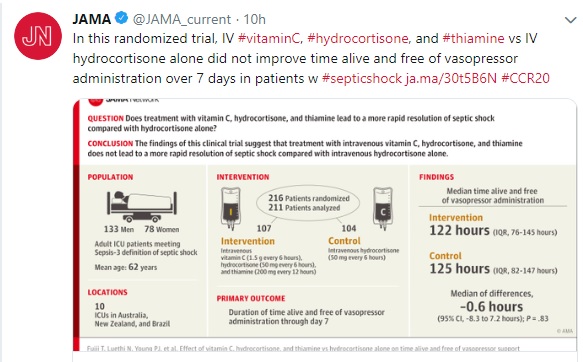
For social media, perhaps a single summary sentence is needed to fit the constraints of a character limit. For readers who prefer a more visual summary, especially through social media, a visual abstract can be useful. These are eye-catching depictions of the research, often using icons and very brief wording.

Medical editors may be tasked with reviewing, editing, or even writing some of these pieces. In doing so, a few tips might be helpful.
First, make sure the shorter piece is consistent with the main article. Numbers should match and any data in the shorter piece should be included in the main article.
Second, make sure the trimmed text doesn’t overstate the study’s results. For example, “This study suggests that X is associated with Y” is different from “X affects Y.”
Third, make sure the most important information is emphasized: “This [study type] examines [primary outcome] in [population].”
Fourth, remember the audience. The short items should be able to draw someone in to read the more technical information in the main article.
A journal article may be the culmination of an investigator’s life’s work or the end of a trial that has cost millions of dollars, which may make an article’s 1-sentence blurb seem measly. However, a patient may search social media to find information on a rare disease, and a post could bring the patient to the full article. A physician may scan key points to see if an article looks interesting enough to read fully. A student could review abstracts to find articles that are helpful for a research project. An investigator might use the full article to replicate the study or as a springboard for further research.
Each breakdown serves a purpose, promoting the right information to the right audience.–Shannon Sparenga

“a 1-sentence summary on the back, a slightly longer summary on the back, and, yes, more promotional blurbs on the back and inside the front cover.”
Do you mean a tagline and [or?] a 1-sentence summary or a promotional blurb on the front cover, a slightly longer summary on the back cover, and more promotional blurbs on the back cover and on the inside front cover?
Also, IMRAD or IMRaD?