Get to the Point!

Here comes Hank. Too late, he’s spotted you, and now you’re in for another story—or rather, a litany of unnecessary details. “I said this, and she said that, and then I said, ‘Really!’” Hank never edits himself; he simply tells you E-V-E-R-Y-T-H-I-N-G until you’re screaming inwardly, “Get to the point!”

While editing manuscripts, I periodically encounter a “Hank” author. Every tidbit of information is important and, in his view, absolutely necessary. Along with his manuscript, which includes the maximum-allowed 5 tables and/or figures, he provides a Supplement that comprises 3 eMethods sections, an eResults, 14 eTables, and 9 eFigures. Data, data, and more data, until the Supplement resembles a closet stuffed by an 8-year-old who was told to clean her room. Everything. It’s all in there.

Consider the busy physician-reader. After perusing the array of freshly published articles in the journal website’s New Online section, she may click on Hank’s title and see that long list of supplemental material populating the scholar’s margin. However transparent the author endeavored to be by providing so much information, she doesn’t have time to read it all now; she needs summaries.

AMA style advocates that “tables and figures demonstrate relationships among data and other types of information” and that “a figure should be used if the relationships are complex….Like a paragraph, each…figure should be cohesive and focused.”

With that reader in mind, the manuscript editor reformats the author’s originally supplied figures to journal style and hones each one to present the material clearly. No chartjunk, no extraneous elements, no distracting line treatments.

Flow diagrams show the numerical progression of patients through the study: the number screened for inclusion, the number excluded for these reasons, the number enrolled, and the number at each stage, with those excluded or lost to follow-up at each stage also accounted for. The last box shows how many patients made it to the end of the study or were included in the primary analysis. From top to bottom, the progression of numbers makes perfect arithmetic sense.

Figures of multiple clinical, radiologic, or histologic images are labeled to guide the reader: before surgery, 6 months after surgery, 2 years later; magnetic resonance images of brains from patients 1 and 4; or specimens from a healthy individual and a patient with disease preceding another from the patient 1 year after treatment.

Graphs are appropriate to the data presented: bars for frequencies, data markers and error bars for summary data, forest plots for meta-analyses. All axes and ticks are clearly labeled, curves are identified by direct labeling or by the inclusion of concise figure keys, and bars and data markers are a solid color for the patients who received treatment and without color for those who received placebo. The numbers of patients at risk at each time point lend additional meaning to Kaplan-Meier survival curves. Forest plots include numerical data in addition to the illustrated plot points, with labels on either side of the graph’s vertical line at 1.0 to indicate whether each data marker’s location favored treatment or no treatment.

Back to our reader. Time is short, so she starts with the abstract. Words are read quickly, their meaning filtered through her years of accumulated knowledge and absorbed. She takes in the tables next. Row upon row of data; numbers represent baseline characteristics, laboratory results, and statistical analysis. Again, the numbers are filtered for meaning and digested for information that can help the reader treat her own patients. She studies the figures, and their meaning is immediately apparent: the bar for affected patients from one age group is taller, a survival curve is higher and longer for patients who received the lower dosage, the difference between 2 clinical images before and after treatment is obvious. No filter needed. Instantly clear. Results from years of the author’s research are visually summarized, seen by the reader, grasped, and understood.

The Supplement stands ready for closer investigation, but first the point must not be obscured. State it—illustrate it—clearly.—Connie Manno, ELS


Quoth the Raven

The word impact as a verb comes up pretty often in the course of my work. I am not a fan (and neither is the AMA Manual of Style). I prefer to use affect instead, and when it comes to nouns I like effect better than impact, but I always had to stop and think about it and be sure that I was correctly using these words. I just could not remember. Then, a few weeks ago, I was poking around the internet and came across this useful mnemonic device, RAVEN.

“Remember: Affect is a Verb and Effect is a Noun.”

It’s not a new thing, but I hadn’t heard it before. It stuck in my mind because crows and ravens, those smart, handsome birds, are very interesting to me. Since then, I’ve noticed that the phrase popped into my head right away when I was confronted with the effect/affect question.

Happy Halloween!—Karen Boyd


Discard the Rest

For several years, I have had a healthy curiosity with minimalism. I’ve listened to TED talks and watched documentaries about the topic and pared down my items accordingly. Last year, I read The Life-Changing Magic of Tidying Up: The Japanese Art of Decluttering and Organizing by Marie Kondo. The author describes a process in which you go through every item you own, keep only what sparks joy or is necessary, and discard the rest. Once you have tidied up your belongings, your mind is free to tackle other issues. This process resonated with me, perhaps because it seemed quite similar to my approach to medical editing.

Part of our job as editors is to remove redundancy in manuscripts—to tidy it up, if you will. We go through a manuscript word for word and carefully discard what phrases or words that do not serve the science (with the author’s approval, of course). Omitting unnecessary words can improve readability. In making an author’s work clearer and more concise, readers are able to tackle other issues, such as responding to the research or designing their own studies. Moreover, scientific writing should be as precise as possible to avoid misinterpretation. Below are some tips, adapted from AMA Manual of Style 11.1.

Some common redundancies that can typically be avoided (redundant words are italicized):

  • first initiated
  • skin rash
  • herein we describe
  • past history
  • period of time, time period, point in time
  • whether or not [unless the intent is to give equal emphasis to the alternative]
  • younger [older] than 50 years of age

Here are some common words and phrases that can usually be omitted without affecting meaning:

  • as already stated
  • it goes without saying
  • it is important [interesting] to note
  • it was demonstrated that
  • take steps to

And here are some expressions to avoid and what to use instead:

Avoid Better
in terms of in, of, for
an increased [decreased] number of more [fewer]
as the result of because of
during the time that while
in close proximity to near
in regard to, with regard to about, regarding
the majority of most
have an effect [impact] on affect

When editing and reducing redundancy, a balance must be struck. Deleting or rewriting too much may lead to accidentally altering the author’s intended meaning, which could adversely affect the author-editor relationship or perhaps even result in a correction after publication. I have been tempted to rewrite sentences, but I have to remind myself that this is the author’s work, not mine. Our responsibility as manuscript editors is to make a research paper as readable as possible so the science is the main focus.—Iris Y. Lo

People-First Language

In the new Netflix series Atypical, a father attends a support group meeting for parents of children with autism. As he begins to describe how well his son has been doing lately as an “autistic person,” he is gently interrupted by the support group leader.  She stresses the importance of him using “people-first” language, that his son is not an autistic person, but rather a person with autism. When she intercedes again to remind him that his son can’t get “better” from autism, he stares at her blankly while his wife (who is more well-versed in the appropriate vocabulary) interjects with an explanation of their son’s recent progress using replacement behaviors.

The scene is played to parodic effect—the support group leader comes across as a pretentious pedant who pays more sensitivity to correct language use than to an exasperated father who is struggling to connect with his son. The insistence on using people-first language is seen as a distraction from what is really being communicated, and I couldn’t help but be reminded of similar reactions from authors over this same issue. How many times as a manuscript editor have I rolled my eyes when I’ve seen the phrase “the patient was diagnosed with” and known I’d have to significantly restructure the sentence? How many authors have been annoyed with the sea of red strikethroughs they encounter because their article is filled with “autistic patients” or “diabetics ” or “the disabled”?

But yet, whenever I explain to authors that AMA style is strict about not defining patients by their illnesses or survivors by their experiences, they get it. “Oh yeah,” they say, “that makes sense.” They understand that it’s important for patients to have autonomy and a sense of personhood, that it’s important to recognize that behind the data are human beings who trying to live their lives while facing all sorts of experiences, of which illness may only be one.

There has been considerable pushback from politicians, corporate leaders, and even comedians against what is seen as a culture of “political correctness,” with people bemoaning that there is a social imperative to use what they see as arbitrary substitutions for words that are considered insensitive or offensive. But what good word nerds know (and manuscript editors take that title with pride) is that words and the way we choose to use them are symbolic and communicate more than their definitions.  And that is why AMA style is committed to using its reputation as an industry standard to set a tone of inclusion and sensitivity for medical discourse, a tone that states that these values are not only accepted but required.—Amanda Ehrhardt

Singular They

One of the more common mistakes I come across while editing is improper use of the singular they. People use it all the time informally, so it often creeps up in more formal writing and authors don’t even know it’s incorrect. Sometimes it’s easy to rewrite the sentence as plural, but other times it’s a real struggle. That’s why I was excited about the recent trend toward allowing it in certain cases. Both the AP Stylebook and the Chicago Manual of Style updated their policies earlier this year to include a few exceptions when rewriting the sentence as plural would be awkward or unclear.

The AP Stylebook now includes 3 examples of when singular they can be used:

  1. A singular they might be used when an anonymous source’s gender must be shielded and other wording is overly awkward.
  2. When an indefinite pronoun (anyone, everyone, someone) or unspecified/unknown gender (a person, the victim, the winner) is used.
  3. In stories about people who identify as neither male nor female or ask not to be referred to as he/she/him/her.

The 17th edition of the Chicago Manual of Style now includes 2 ways in which they can have a singular meaning.

  1. When referring to someone whose gender is unknown or unspecified. This use of the singular is acceptable in speech and informal writing, but for formal writing, Chicago still recommends avoiding it, offering various other ways to achieve bias-free language.
  2. When a specific, known person does not identify with a gender-specific pronoun such as he or she. This usage is still not widespread either in speech or in writing, but Chicago accepts it even in formal writing.

The AMA Manual of Style will follow suit with the next edition, allowing the use of plural pronouns with singular indefinite antecedents (eg, Everyone allocates their time) in an effort to avoid sex-specific pronouns and awkward sentence structure.

Even though there’s more flexibility with the singular they than before, in most cases rewording usually is possible and still always preferable, especially in formal writing.—Tracy Frey


The Use of Cause-and-Effect Language in the JAMA Network Journals

As a manuscript editor and freelance manuscript editing coordinator for the JAMA Network specialty journals, I am constantly having to edit out cause-and-effect language from observational studies that are not randomized clinical trials. According to the AMA Manual of Style, the word effect, as a verb, means to bring about a change; as a noun, it means result.

A randomized clinical trial is one of the few types of studies that are designed to assess the efficacy of a treatment or intervention (and thus allowed to use cause-and-effect language) because the participants are treated in controlled, standardized, and highly monitored settings.

Whenever I come across a study in which the authors are trying to determine, for example, whether the use of a certain type of drug will reduce the risk of some complication following a certain type of surgery, I need to verify whether the study is a randomized clinical trial or a report of a controlled laboratory experiment. If it isn’t, and is a report of an observational study (such as a cohort, cross-sectional, case-control, or case series study, or a meta-analysis), then all cause-and-effect language must be replaced. But by what?

Generally, association may be a useful replacement for effect. The AMA Manual of Style defines association as a “statistically significant relationship between 2 variables in which one does not necessarily cause the other. When 2 variables are measured simultaneously, association rather than causation generally is all that can be assessed.” So instead of saying the “effect of this on that,” rephrase as the “association of this with that” or the “association between this and that.”

Sometimes, however, the authors don’t agree and want me to change it back, in which case I calmly let the authors know that it is AMA style to allow cause-and-effect language only for randomized clinical trials and controlled laboratory experiments and that, perhaps in the “Discussion” section of their manuscript, they can try to make arguments to support that the association might be causal. However, to quote from one of our scientific editors, “the expression and ultimate interpretation of the findings can’t be causal.”

The use of cause-and-effect language is quite common in everyday speech, and so it is easy for most people to assume that if one event comes before another, then the first is the cause of the second. In the JAMA Network journals, findings that rely on this type of logic had to have been rigorously tested in a randomized clinical trial.—Paul Ruich


Everything Is Relative (Pronouns)

Unless you fell down a Google rabbit hole and ended up here unintentionally, you’re probably already aware just how much information is contained in the AMA Manual of Style. But to put it in perspective, the style guide’s current iteration contains 1010 pages, and that’s not counting the pages at the very beginning that are numbered with Roman numerals (because no one reads those anyway, right? [sorry Cheryl]). Still, despite the borderline-unmanageable amount of information in the AMA Manual of Style, the articles I edit on a day-to-day basis are usually very sound regarding obscure rules found 3 bullet points below a niche subsection of information explaining…you-name-it. I can generally count on authors to italicize gene names and keep corresponding proteins unitalicized or to capitalize virus terms that end in -virales, -viridae, or -virinae, etc.

But the cost of the attention to the more complicated nuances of AMA style seems to be that baseline grammatical rules get overlooked. I’m not saying that the articles that hit my desk are anarchically grammarless, but there are usually at least 1 or 2 hard-and-fast grammatical conventions that get ignored. And the rule that gets violated far and beyond all the others pertains to the usage of the relative pronouns “that” and “which.”

So here’s a quick refresher for everyone (myself included): A restrictive clause directly affects the intended meaning of the subject in the preceding clause, and restrictive clauses are introduced by “that.” Nonrestrictive clauses are not necessary to the intended meaning of the subject in the preceding clause, and nonrestrictive clauses are introduced by “which.”

Example of a restrictive clause: The band The National wrote a song that is my favorite song. Because “that is my favorite song” modifies the subject “song” to a degree essential for the intended meaning, a restrictive clause introduced with “that” is necessary (the subject “song” would not be the particular song in question—my favorite song—if the restrictive clause wasn’t present). The modified subject’s intended meaning hinges on the restrictive clause.

Example of a nonrestrictive clause: The band The National wrote a song called “The Geese of Beverly Road,” which is a perfect example of early-00’s indie-rock songwriting. Because “which is a perfect example…” simply describes the subject “song” and doesn’t change its intended meaning, all that’s required is a nonrestrictive clause introduced with “which.” The modified subject would still be the song in question (“The Geese of Beverly Road”) in this context without the information the nonrestrictive clause provides.

I know, I know, this seems to be a nitpicky issue that no one save the professional manuscript editor would get hung up on, but precision with language hinges on attention to grammatical detail, which is crucial when presenting scholarly research and information.—Sam Wilder

Everybody Tweet Now

Confession time: I have a bit of a Twitter problem. I follow over 1200 different accounts, and probably add another each day. I am not enough of a photographer, or even enough of a visually oriented person, for Instagram. Facebook increasingly annoys me with its endless ads and its “pivot to video.” (WHY.) Twitter is where I’m going to spend (or waste, depending on your point of view) most of my screwing-around-online time.

Sometimes I just let the Twitter timeline wash over me in one big stream, and enjoy the crazy, constantly updated mix of content. But because I follow a lot of accounts, I also make use of lists. I’ve got a list for “breaking news,” a list for Chicago-centric stuff, a “literary” list, with my favorite writers and magazines, and lists for hockey and football. (Go Hawks/Bears!)

(And of course: Make sure you follow the AMA Manual of Style! Follow @AMAManual! Or forever drift, rudderless, through a sea of regret!)

I also follow several novelty accounts, just for the laughs, like the one that tells you every Wednesday that it is Wednesday. With a Budgett’s frog.

Okay, that’s silly (albeit awesome). However, it occurred to me that a few of those novelty accounts are (vaguely) (very vaguely) editing-related. For instance, I follow That’s Not A Word (@nixicon), where a dedicated linguistics scholar laboriously retweets instances of people on Twitter claiming something is not a word.


(For an entertaining, conducted-over-Twitter argument about something not being a word, see the Language Log’s summary of the dust-up between linguist Ben Zimmer (@bgzimmer) and The Atlantic about whether “gift” can be a verb. (Spoiler: of course it can.)

And finally, just for the delicious irony: it’s always nice to see @whostheidiotnow pop up in my feed, an account that collects and retweets people who say “your [sic] an idiot” to other people on Twitter. Warning: there are a LOT of idiots out there. Apparently.—Brenda Gregoline, ELS


Have You Talked to Your Tables About the Dangers of Sex Bias?

The problem of bias is well documented in the biosciences. Even since the Health Revitalization Act of 1993, which laid out guidelines intended to ensure more equitable representation of women and minorities in federally funded scientific research, the problem persists. A 2010 study published in The Journal of Women’s Health found that, among 46 clinical studies enrolling both sexes, women comprised on average 37% of the participants, and among 69 studies, 87% did not conduct analyses by race or ethnicity, and 18% did not report differences in the racial makeup of the study sample at all. Examples of this sort abound and, setting aside the pernicious sociohistorical and nuanced biologic reasons for this phenomenon, the resulting reality is that medicine, as applied to women and minorities, is less evidence based because most research is extrapolated from a homogeneous population—white men.

But even as we attempt to resolve these problems—ensuring that guidelines are in place and that they are followed when conducting new research—there is another, more subtle way that these biases creep into the biomedical literature. Even if the study itself was conducted using a diverse population of participants, sometimes the reporting elides this fact.  As a manuscript editor I have encountered this problem more often than one would expect, and the culprit is usually the table.

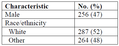
In this table, as in many tables that I have encountered, “white” and “male” are the default. Women’s bodies and the bodies of racial and ethnic minorities are implied by the number of white male bodies present.

A good rule when presenting data in tables is to make sure that when you are reporting the sex of participants, if you choose to report only 1 sex, choose the sex that constitutes the majority of the sample. When reporting on racial and ethnic differences, be as specific as possible (even if these comprise a small percentage of participants). Who are the “others?”

The current edition of the AMA Manual of Style does not explicitly lay out these precautions, but in chapter 4, section 1, you will notice that every example shown for presenting data in tables follows these guidelines.

This is not merely a problem of “political correctness” or social equity—it is a question of accurate reporting and just plain good science.—Gabriel Dietz


Forest Plots: The Basics

When I was recently asked to give a presentation on forest plots at work, I was less than enthused. Figures are my least favorite part of a manuscript to edit because they usually require a lot of tedious work, and determining how to best visually present statistics makes my brain hurt. Forest plots in particular had become the subject of my nightmares leading up to the time of preparation of my presentation after a few experiences with editing unwieldy ones. However, thanks to being subjected to presenting on forest plots, I’ve gained some basic knowledge that I thought I would share.

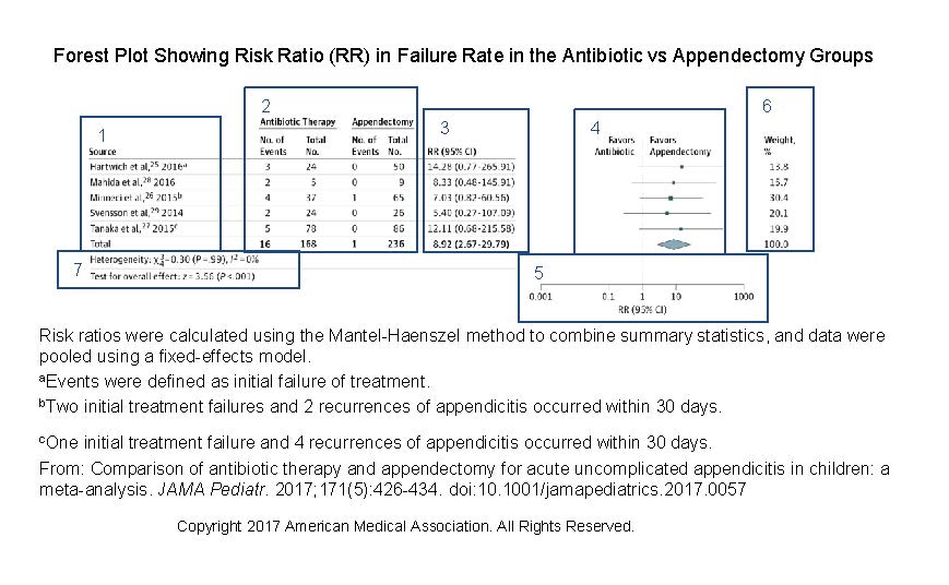
There are a few types of forest plots, namely those presenting the results of meta-analyses and those presenting subgroup analyses. Here, I will focus on a forest plot for a meta-analysis. In a meta-analysis, a forest plot acts as a visual representation of the results of the individual studies and the overall result of the analysis. It also shows overall effect estimates and study heterogeneity (ie, variation in results in the individual studies). A forest plot for ratio data should include the following data:

  1. The sources included in the meta-analysis, with citations. If the source author or study name is listed more than once, query the author to ensure that the study samples are unique; overlapping samples would lead to inaccurate estimates. Also, remember to renumber the references if you have renumbered them in the body of the article.
  2. The number of events and total number of participants in each group of the study and in the combined studies.
  3. Risk ratio and 95% CI for each study and overall.
  4. Graphed relative risk and 95% CI, with top labels describing what data markers on either side of the null line mean. The squares represent the results of each study and are centered on the point estimate, with the horizontal line in the center representing the 95% CI. The diamond shows the overall meta-analysis estimate, with the center representing the pooled estimate and the horizontal tips indicating the confidence limits.
  5. Log scale for the x axis with a label indicating the measure.
  6. Percentage of weight given to the study. Weights are given when pooled results are presented. Studies with narrower confidence intervals are weighted more heavily.
  7. Heterogeneity and data on overall effect.

(Open image in a new tab to see more detail.)

The caption should indicate the test and model (fixed or random effects) used in the evaluation and may include an explanation of the meaning of the different marker sizes.

If you follow these basic rules, forest plots are a breeze. —Sara M. Billings