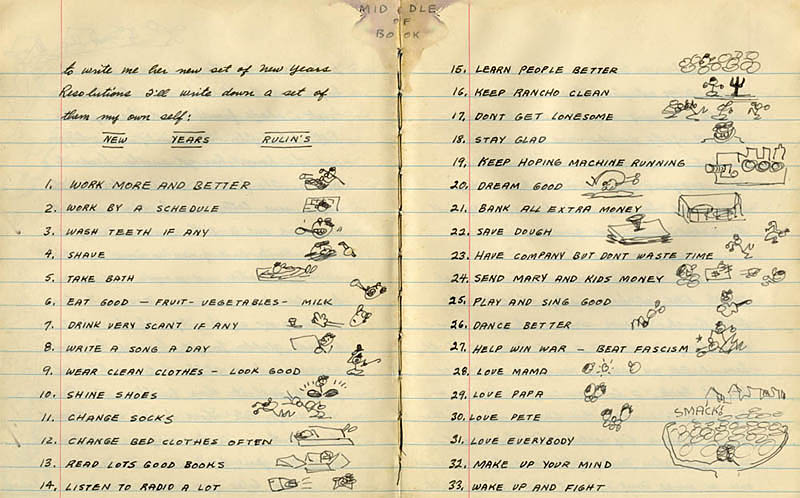
“NEW YEARS RULIN’S”

As a long-time manuscript editor, it’s not often that I come across things that are full of grammatical errors, but don’t need a lick of editing and are perfect just as they are.

I’ve had Woody Guthrie’s NEW YEARS RULIN’S tacked up in my cube for a while now, and periodically take it down and examine it and marvel at it.

These RULIN’S  are as good as any life advice from any philosopher. What better advice could a person offer than, for instance, to Love Everybody, Learn People Better, Read Lots Good Books, Stay Glad, or Keep Hoping Machine Running—not to mention Dream Good and Change Socks? I love his little sketches and “Middle of Book” note.

I don’t know if Woody was laying on the rustic, ungrammatical charm in his RULIN’S, but I wouldn’t change a thing if asked to edit this advice for a good life.—Karen Boyd

Per Capitalization

Individual words do not usually trigger the same devotion as, say, favorite songs. Yet some people find the time to have a favorite word. A TV host conducts interviews famous for including the question, “What is your favorite word?” His guests know it’s coming, so they are prepared with a word or phrase chosen for either meaning or sound. I have wondered if the favorites are situational. Who can have just one favorite word?

The “sound” choices indicate an appreciation for the particulars of articulation. That is where my instinct points too. No one has asked me lately if I have a favorite word. Then again, I have not been interviewed on Inside the Actor’s Studio. However, there is one phrase I have had to think about so much that it has become a favorite.

“Per capita” occupies a plot of linguistic real estate in my head. Not only is “per capita” a trifecta of plosives (bilabial, lingua-alveolar, and lingua-velar) separating the vowels with a postalveolar “r” thrown in, the phrase also has a pleasing rhythm. It is fun to say and snaps with the summery crispness of the waffle cone holding your scoop of pralines and cream.

Best of all, it presents a hotbed of style issues just waiting for AMA Manual of Style application.

“Per capita” became the contested part of an axis label earlier this year. While not quite an axis of evil, the label was rather vexing. All roads lead to Rome, and all questions lead to the AMA Manual of Style. In Section 4.2.7, “Axis labels in figures are akin to column headings in table, so each word should be capitalized (except minor words such as prepositions of less than 4 letters).” As first presented on the axis label, “per” followed style for a minor word and was thus lowercase. One reviewer suggested initial cap “Per,” which met with the author’s enthusiastic approval. After all, “per capita” is not only a minor preposition with a major noun; it’s so much more! The manual refers to Merriam-Webster’s Collegiate Dictionary as an authority. “Per capita” receives its own dictionary entry, so AMA style considers it a single entity. I went along for the ride, on the right track to make an author happy.

A round later, another reviewer indicated that “per” is never initial cap in JAMA Network journals. I searched “per capita” on The JAMA Network site and the hits from 2010 to the present indicated roughly half with lowercase “per,” roughly half with uppercase “per,” and an outlier with initial cap and hyphen. It appeared that style was up for grabs. I reverted to lowercase, asked for the author’s understanding, and moved on.

Not long after, I mentioned the exchange to an AMA veteran. After a pause, he said, “Well, maybe per capita is considered a foreign phrase like in vitro.”

Wish I had thought of that.

I had lost sight of the origin: Latin for “by the head,” an obvious parallel to Latin for “in glass.” The pesky “per” had sidetracked me. In Section 10.2.1, “In compound terms from languages other than English, capitalize all parts of the expression.” Hence Per Capita. Of course Per Capita reappeared, the next  time in the title of a reference to a book. Now I will be ever alert to “per capita” wherever it may need to be in title case.

The takeaway is that “per capita” in an axis label illustrates several manual of style tenets: follow the latest edition of Merriam-Webster’s, consider word function (stand-alone “per” which is lowercase vs compound term “Per Capita”) in applying the “minor words” rule, and capitalize all parts of a compound term from another language. Not a bad litany of accomplishments for 4 syllables.

Back to favorite words. An article on that topic might not easily fit into one of the network journals, but I would like to see a figure that plots the number of favorite words for each capita in a study population. (The style guide does not rule on whether “capita” can be sold separately from “per” but “for each” seems a good stand-in.). When the day comes that a JAMA Psychiatry article presents a figure depicting Number of Favorite Words Per Capita in Adults Who Edit, I will know this journey has come full circle.—Timothy Gray
Readability

A common assumption about those of us who copy edit science papers is that we have a science background. Some of us do, but by no means all. After [mumble-number] years in the medical publishing field, I might feel like I “practically” went to medical school, but I did not. I could probably take out your gallbladder, though. Want to let me try?

Anyway, as long as you are a good reader, writer, thinker, and editor, and know your way around IMRAD, it is possible to edit a manuscript on a wholly unfamiliar topic. The authors are the content experts; the paper has (probably) been through peer review; and the copy editors have skills, coffee, and Google.

When a paper is excruciatingly hard to edit, it’s not usually because of the science but because of the writing. Some authors pile up jargon like hoarders collect cans of beans, as protection against the deadly apocalypse of someone being able to read their article without feeling squashed by the weight of all those words. Why settle for a teeny nothing word like “use” when “utilize” sounds so much more important? Why give us actual data when you can just talk about “trends” and “robustness”? Make sure you add a lot of “it has been shown that” and “the fact that.” And make sure you start every sentence in the Discussion section with “furthermore” or “moreover”!

Real talk from Nature: “You can always look up jargon, but with a poorly constructed sentence you’re on your own.” The best-case scenario between author and manuscript editor is a partnership—we don’t want to be on our own! We want to help explain complicated things in a simple way, and that often starts with authors picking the most direct words available.—Brenda Gregoline, ELS

Punctuation Gets Famous


It’s great to see that copy editors are finally being given the positive attention we deserve. There are now “copyediting stars” like Mary Norris of The New Yorker; John E. McIntyre of the Baltimore Sun; Lynne Truss, author of Eats, Shoots & Leaves; and author and podcast personality Mignon Fogarty, the “Grammar Girl,” who “sparked what you might call a worldwide, syntax-driven fiesta.”

I have to admit that I am surprised as well as pleased by this trend. A while back, when I was taking a break from editing to be a substitute teacher, I wondered if texting-style spelling, the overreliance on spellcheck, and the absence of diagramming sentences in school meant that attention to proper spelling and grammar would become a lost art in the everyday world. Would people outside of scholarly publishing give a darn about, say, the serial comma?

It turns out they do. Witness the case of the Oakhurst Dairy in Maine. The Maine Legislative Drafting Manual does not approve of the serial comma; therefore, there is none in the state law regulating overtime: “The canning, processing, preserving, freezing, drying, marketing, storing, packing for shipment or distribution of: (1) Agricultural produce; (2) Meat and fish products; and (3) Perishable foods.” The ambiguity created by the lack of a comma after “shipment” resulted in Maine truck drivers winning a lawsuit that could cost Oakhurst Dairy $10 million. Some folks may find the serial comma superfluous—but I say that a little symbol that could save a company $10 million is nothing to sneeze at. That fact that so many articles were written about this case show that there is an interest in such topics.—Karen Boyd

Ding Dong: the Death Dagger Is Dead

AMA Manual of Style, section 2.3.2, has an ominous subheading: “Death.” I’ve quoted it below:

Death. If an author of an article has died before the article goes to press or is posted online, a death dagger (†) should follow the author’s name in the byline, and one of the following footnotes should be inserted after the author affiliation footnote.

†Died November 17, 2005.

†Deceased.

Okay. That’s super-goth and all, but…why? Is that useful information for a reader? Does it serve any purpose other than a moment of recognition that life is fleeting, memento mori, etc?

Also, the life of a scholarly article is long—why single out the author who died during a relatively narrow window (from acceptance to publication)? We’re all going to die someday, including every byline author. (Sorry if you came to AMA Style Insider for happy feelings. Here is a picture of a puppy.)

At a recent stylebook committee meeting, we decided to kill the death dagger. (Get it?) If authors want to note that a coauthor is deceased, a note can be put into the acknowledgment section instead.

Interestingly, the dagger symbol is sometimes called an obelus. A variant on this symbol was probably used by Homeric scholar Zenodotus to critically mark lines in manuscripts that were of dubious attribution. The Oxford English Dictionary uses it to note that a word is obsolete. It seems a bit cruel to use the same typographical mark to denote a person as dead and to mark a word as obsolete—-but I suppose I can see the connection.—Brenda Gregoline, ELS


New-Fangled Help for the Grammar Police

I’d been pondering what to write about next for our AMA Style blog, and by happy coincidence someone sent me a link to a Mental Floss article about a great new iMessage app for those manuscript editors and proofreaders who get a little twitch whenever they receive a text from someone with a free-wheelin’ approach to spelling and grammar: the appropriately named Grammar Snob by Apps From Outer Space LLC, available at iTunes. At $0.99, this seems like a real  bargain for grammar cops, maybe youthful ones especially, because errors are corrected by using stickers. Or maybe I should say eStickers. “Tap and hold to peel them off so you can place them in just the right spot,” instructs the website, which also features iMessage screenshots of Grammar Snobbery in action. (Fortunately for my friends and family members, I do not own an iPhone, so I will not be terrorizing them with these grammar stickers any time soon.)

But I can’t help wondering about whether using eStickers could possibly be as satisfying as stealth-proofreading with a real pencil or pen. I know that compulsive correctors are out there…I’ve seen the discreet notations in library books and signs in the train station elevator, to name a few. Besides typos, misuse of plurals and apostrophes seems to inspire the most common calls to action: “condo’s for rent,” “girl’s night out,” “the Smith’s party.” Here’s a good one from Apostrophe Abuse: “Cheffin’s Cheesesteak’s and Cubano’s.” In 2014, Grammarly had “a cut-throat competition to determine the most ‘maddening, writing error concluded… with MISUSED APOSTROPHES crowned as the undisputed Grammar Madness bracket champion” (eg, “Deep Fried Oreo’s”). These are the types of errors that editors and proofreaders sometimes cannot leave uncorrected. We just can’t help ourselves. So when faced with an error that needs to be corrected in a friend’s ungrammatical text, the Grammar Snob app is a nice resource to add to our editorial “armamentarium,” although you may not be surprised to learn that it will likely “turn you into a super annoying person.”Karen Boyd


Weeds and Words

Here at AMA Manual of Style headquarters, there is snow on the ground and all the weeds are mostly dead. However, that doesn’t mean we don’t “get into the weeds” on a near-daily basis, particularly during style manual committee meetings. Here’s a post from The Word Detective that explores, but does not solve, the mysteries of that phrase’s origin. —Brenda Gregoline, ELS

Questions From Users of the Manual

126291-simple-black-square-icon-alphanumeric-percent-sign

Q: I appreciate the difference between percentile and percentage, but can you shed light on the difference between percentile and centile?

A: Ed Livingston, MD, a JAMA deputy editor and author of the statistics chapter in the 11th edition of our style manual, responds:

Percentile refers to the percentage below which a group of observations fall, ie, 93 percentile means that 93% of the observations fell below that value. If I had a score that was in the 85th percentile, I had a score that was better than 85% of all people taking that test.

Centile refers to which group an observation belongs to when the population is divided into 100 equal groups, like a quartile. With a quartile there are 4 equal-sized groups and with a centile there are 100 equal-sized groups—so in practice it’s the same as a percentile. —Cheryl Iverson, MA

Questions From Users of the Manual

Q: How should a photograph or illustration be cited in the reference list?

A: In the reference list, cite the article in which the figure you want to reference appears in the “usual” way of citing a journal article. In the text, where you cite the reference, use the following style:

As Christiansen and Fischer [add superscript citation here to the appropriate reference number…you could also include the number of the page on which the figure you are citing appears, in parentheses] illustrate in Figure 1 of their study….

—Cheryl Iverson, MA

Waffling on the Internet: To Cap or Not

When I signed up to write a blog post on the decision this year by the New York Times and the Associated Press to stop capitalizing the term internet, I thought it would be a good way to come to terms with the decision by The JAMA Network to follow this style. My first thought had been, “Internet’s gotta be capitalized!” I’ve been capitalizing this word for a long time—since Google was invented and people could “surf” on it. I felt that it wasn’t right to use lowercase.

When the word is not initial capped, the wonder that is the internet seems somehow diminished. Reading about pros and cons, I discovered that feelings can run high on this subject, and people have very definite ideas about Internet vs internet. On the Grammarist’s website, people point out that there can be many internets—interconnected computers—but there is only 1 Internet, a kind of internet that would be hard to live without.

Alas, the internet is no longer a magical place—it’s something mundane, like radio or television or cable. But I am old enough to remember when it did feel magical. There weren’t many things to look up or opportunities to surf, but you just knew those days were coming.

On the one hand, as several Grammarist commenters pointed out, originally Internet referred to the internet delivered by the Internet Engineering Task Force and the Internet Corporation for Assigned Names and Numbers—it was a very specific institution. Its precursor was the ARPANET, which dates back to the 1960s. One the other hand, according to Wikipedia, “the designers of early computer networks used internet both as a noun and as a verb in shorthand form of internetwork or internetworking, meaning interconnecting computer networks.”

I see both sides of the argument. Although old habits die hard, ultimately, one has to has to go with the flow, especially in the workplace. The internet, if nothing else, is all about change and updates.—Karen Boyd