Connie Manno, ELS, Director, Freelance Editing Unit, JAMA Network
Venn diagrams are simple pictorial representations of relationships that exist between 2 or more sets of things. Circles that overlap have commonality; circles that do not overlap do not share traits.1
Although Venn diagrams represent conceptual shared or unique traits between separate ideas or groups of things (Figure 1), they are not appropriate to visualize numerical (empirical) data.2
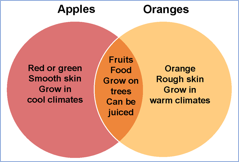
Figure 1. Conceptual Venn Diagram
Often, the separate sets are presented as identically sized circles—even if the quantities in each set and the overlapping and nonoverlapping segments are different—and the resulting illustration can be not only imprecise but also misleading (Figure 2).3
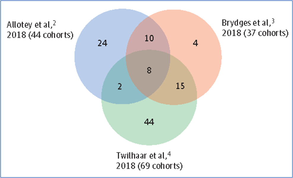
Figure 2. Venn Diagram of Identically Sized Circles That Represent Different Quantities
The identically sized circles obscure the different numbers of cohorts included in the referenced studies. From Sentenac et al.3
Like pie charts, which also compare relationships among component parts and are frequently used to depict data for a lay audience, Venn diagrams should be avoided in scientific publications.4(pp137-138)
One more precise way to present the data is to create a bar graph or component bar graph (Figure 3), which can present the relationships between 2 or more data sets while illustrating the size difference between the sets with bars of unequal lengths. A component bar graph additionally uses color and section length to highlight patterns in the data.2
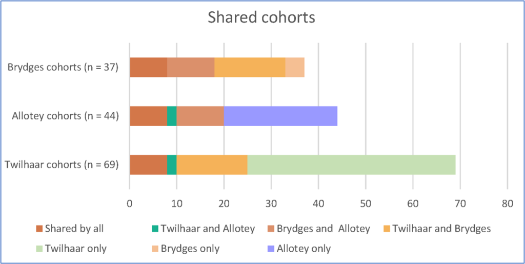
Figure 3. Data as a Component Bar Graph
When the data from Figure 2 are presented as a component bar graph, the difference in cohort sizes is apparent from the bar lengths. In addition, bar sections that depict shared segments use the same color.
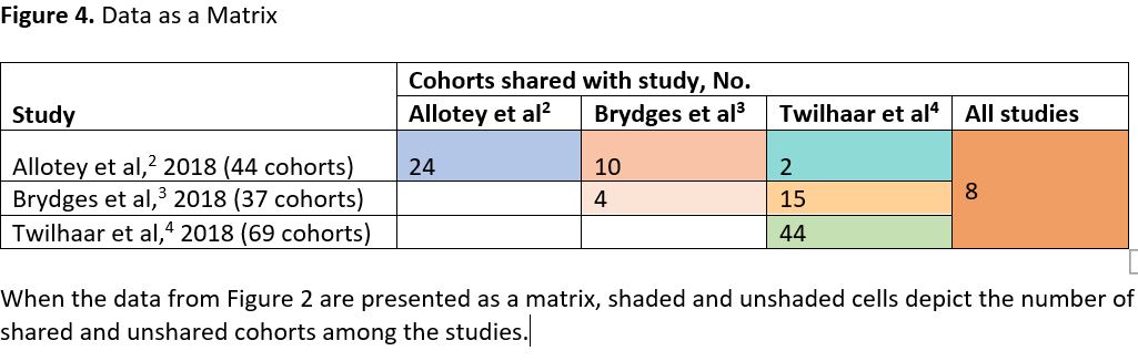
Another option is to present the data in a matrix: a tabular structure that uses numbers, short words (eg, no, yes), symbols (eg, bullets, check marks), or shading to depict relationships among items in columns and rows and to allow comparisons among entries.4(p114)
Depending on the complexity of the construction and the need for multiple colors or shading, a matrix may be presented as a table or figure (Figure 4).
A third option is to resize the circles to make them more proportional to the quantities they represent (Figure 5), but only if the circles and overlaps are precise and generated from statistical software.
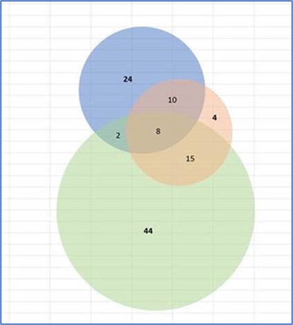
Figure 5. Circles From Figure 2 Resized to More Accurately Represent the Sample Sizes
This option must use precisely sized circles and overlaps generated from statistical software to ensure that the figure’s elements are truly proportional.
Network figures that use nodes and connecting lines of varying sizes to illustrate the proportions of the compared items are also useful for depicting relationships among 2 or more sets of data (Figure 6).5
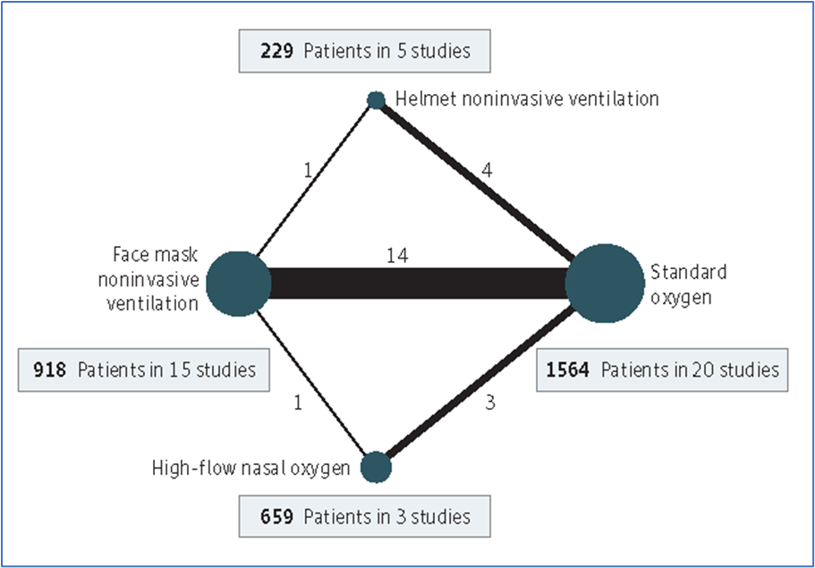
Figure 6. Network Figure Depicting Relationships Among 4 Data Sets
In this network map, the size of the nodes is proportional to the number of participants in each node, and the thickness of the connecting lines is proportional to the number of randomized clinical trials in each comparison. From Ferreyro et al.5
Although data can be displayed multiple ways, accuracy and audience, as well as the criteria of the final format (eg, scientific journal vs consumer publication), should govern the decision of which option to use.
References
- Kenton W. Venn diagram. Investopedia website. Updated January 17, 2020. Accessed February 1, 2021. https://www.investopedia.com/terms/v/venn-diagram.asp
- Harris RM. Bar plots as Venn diagram alternatives. Rayna M. Harris blog. May 7, 2019. Accessed February 1, 2021. https://www.raynamharris.com/blog/vennbar/
- Sentenac M, Boutron I, Draper ES, et al. Defining very preterm populations for systematic reviews with meta-analyses. JAMA Pediatr. 2020;174(10):997-999. doi:10.1001/jamapediatrics.2020.0956
- Tables, figures, and multimedia. In: Christiansen S, Iverson C, Flanagin A, et al. AMA Manual of Style: A Guide for Authors and Editors. 11th ed. Oxford University Press; 2020:113-169.
- Ferreyro BL, Angriman F, Munshi L, et al. Association of noninvasive oxygenation strategies with all-cause mortality in adults with acute hypoxemic respiratory failure: a systematic review and meta-analysis. JAMA. 2020;324(1):57-67. doi:10.1001/jama.2020.9524
In the columns of numbers in Figure 4. Data as a matrix,
the numbers ought to be right aligned (because they all refer to the same thing, namely the number of cohorts.