Pregnancy Language Update

Iris Y. Lo, BA, JAMA Network

The AMA Manual of Style will soon offer guidance on inclusive language when referring to people who are pregnant or people with the capacity for pregnancy.

This wording has more general use and can include individuals who were assigned female at birth, transgender men, nonbinary individuals, gender-nonconforming individuals, and gender-fluid individuals–basically anyone who is physically able to become pregnant.

This language should be used when study investigators have not explicitly asked participants to self-identify their gender. In studies in which participants have all identified as women, it is appropriate to use terms like pregnant women.

However, if study participants have not completley self-reported their gender as women, terms such as pregnant participants, pregnant individuals, and pregnant patients are more accurate. In these cases, birthing parent rather than mother is a more accurate term and should be used for the same reasons.

The JAMA Network has internally started to follow this guidance, joining many other scientific journals, such as Nature, and medical associations and societies, such as the Society for Maternal-Fetal Medicine. The US Preventive Services Task Force also uses this type of language.

Style vs Substance—Is There Room for Both?

Peter J. Olson, ELS, JAMA Network

There’s a scene in the film Pirates of the Caribbean: The Curse of the Black Pearl in which the heroine, Elizabeth, is taken captive by the infamous Captain Barbosa aboard his ship. In an attempt to negotiate her release, she invokes the Pirates Code, a set of rules to which she knows Barbosa is beholden. Barbosa initially appears to comply, then abruptly reneges. When Elizabeth protests his disregard for the Code, Barbosa defends his decision with a snide retort:

“The Code is more what you’d call guidelines than actual rules.”

His deviousness aside, the Captain has a point. As humans, we have an innate tendency to create rules with the intent of establishing order and certainty, yet those rules are occasionally subject to exceptions, inapplicability, and multiple interpretations. Try as we might, it’s virtually impossible to anticipate every possible scenario and account for it, which means there will be times when the rules we make for ourselves simply do not apply—and editorial style rules are no exception.

The question is: does style always supersede substance?

The AMA Manual of Style is a renowned and authoritative reference manual, and for good reason. It’s a meticulously crafted, oft-updated repository of linguistic and stylistic information steeped in authentic medical language and policy, and the guidance within its pages is critical to physicians, authors, and editors alike.

In that sense, the argument could be made that when it comes to the AMA Manual, style is substance. However, as editors, we at times find ourselves in scenarios in which adhering to a particular style point is akin to the proverbial placement of a square peg in a round hole. The gadget doesn’t quite fit into the device, and the results can be ugly. It’s those circumstances in which the absence of a peg may be preferable to the sight of a horribly splintered one.

What’s more, rules are almost always subject to change, and depending on the impetus behind an amendment, it can take the purveyors of a style manual weeks, months, even years to discuss and formulate a responsible and sustainable update before disseminating it to the manual’s users.

Take the topic of race and ethnicity language (Chapter 11.12.3), which continues to evolve at an unprecedentedly rapid pace—enough so that the requisite section in the AMA Manual was updated less than a year after the release of the 11th edition.1 Language and terms that may have been deemed acceptable just months previously may shift suddenly, and the intuitive and attentive editor may need to set aside current style guidelines to align with cultural and/or societal trends.

That said, style deviations should be made only after careful consideration of the potential ramifications, especially those involving reader perception. In other words: if you’re going to deviate from style, you’d better have a really good explanation ready.

Authors are often quick to point out style infractions in previously published material, either to defend their own infringements or to object to style-adherent edits (“If this author got to do it, why can’t I?”), and trivial or inexplicable noncompliance can undermine the authority of your style manual as well as your publication. If you can’t justify a style detour that goes beyond “I just thought it sounded better that way,” you probably shouldn’t take it.

Fictional though he may be, I expect that Captain Barbosa fully honors the Pirates Code—he is a pirate, after all. Yet even he knows to adapt the rules when necessary to achieve his goals. This is not to suggest that editors should swashbuckle their way through a manuscript, playing fast and loose with the style rules they’ve sworn to uphold. Those rules are there for a reason, and they wouldn’t exist if they didn’t almost always apply.

However, absolutism is fraught with its own perils, and the astute editor must be mindful of those rare situations in which a rule may need to be bent—or perhaps broken—for the greater good. And although there’s no single, comprehensive answer to the question of whether and when to sacrifice style for substance, if preserving the integrity of a publication is given precedence, the answers will at least be easier to identify.

Reference

  1. Frey T, Young RK. Race and ethnicity. In: Christiansen SL, Iverson C, Flanagin A, et al, eds. AMA Manual of Style: a Guide for Authors and Editors. 11th ed. Oxford University Press; 2020:545-547.

Icons at the JAMA Network

Nancy Essex, Director, Brand Design, JAMA Network

Good things in small packages: JAMA Network visual abstract icons

Serena Williams. The Nike swoosh. The bald eagle.

What comes to mind when you think of the word “icon”? A tennis superstar, a ubiquitous consumer brand logo, a nation’s official symbol?

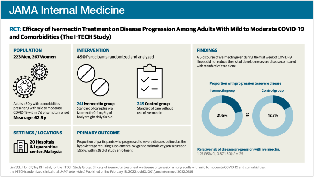
You’d be right, of course. When we use the word icon around JAMA Network lately, it usually suggests those adorable line drawings on our visual abstracts that represent some of your favorite things, like catheters, IV bags, and dermatitis.


(If you’re not familiar with visual abstracts, please visit this overview page. It’s ok, we’ll be here when you get back.)

What is an icon?

An icon can be defined as an emblem or symbol, a pictorial representation of a thing. We are all familiar with software icons, like the envelope, trash can, and folder. Icons are also important in wayfinding and signage–can you imagine being in an airport in a country whose language you don’t speak, trying to find the bathroom without them?

Icons need to be general enough so we don’t have to create a new one for each visual abstract. For instance, a torn meniscus and osteoarthritis of the knee could be represented by a single knee icon.

Of course, those conditions are completely different, but in the context of our visual abstracts, a simple knee icon is often all that’s needed to communicate the basic idea of knee condition.

Details make the design, but not too many details

Icons are an important part of the visual vocabulary used in visual abstracts. To keep everything consistent, we developed the following criteria to guide icon development:

  • Simplicity
    • When it comes to icons, the simpler the better. The viewer should almost be able to sight-read an icon, and so icons must be recognizable with as little detail as possible. Plus, they are small to begin with, so too much detail would make them unreadable blobs when viewed in context on Twitter, for instance.
  • Scale and size
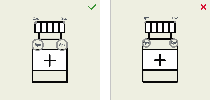
    • Icons are created on a 72px square field— that’s just 1 square inch— to represent interventions, population, and conditions, and on a 32px square field for settings and locations. They are always used in the same size and never scaled up or down.
  • Line quality
    • Icons use a consistent 2px line weight throughout. On a few unavoidable occasions, a narrower line weight can be added for a necessary detail. A rounded end cap is used for the ends of lines to keep everything looking friendly.
  • Angles and corners
    • Because we never know which icons will be used side by side, it’s important to use harmonious and consistent angles and corner radii. This helps to maintain the organized and structured look of the visual abstract layout.
  • Monochromatic color palette
    • Color is kept to black line only. White and tan are used when possible to create an illusion of solidity, and after many requests, light gray has recently been approved for use to add another level of differentiation.
Some do’s and don’ts for visual abstract icons.

We strictly uphold these requirements for a few practical and aesthetic reasons: consistency, brand alignment, efficiency, and, importantly, visual elegance and sophistication.

The JAMA Network icon library has grown to include nearly 300 icons, from acne to radiography, and many things in between.

As you can imagine, it takes many talented people to complete a visual abstract. Manuscript editors, visual abstract editors, managing editors, production graphics, editorial graphics, designers, marketers, social media managers, administrators, and more—we all play a part.

An example of a published JAMA Network visual abstract. For guidance on how to prepare figures for use in visual abstracts, please consult chapter 4.2.10 of the AMA Manual of Style.

Hawaiian Diacritics

Miriam Cintron, BA, JAMA Network

https://decolonialatlas.wordpress.com/2015/06/03/the-hawaiian-islands/

The islands of Hawaiʻi and its people have a culture rich in history, traditions, and the Native Hawaiian language.

Sadly, use of the Native Hawaiian language began to decline in 1896, when it was banned from schools just 3 years after the Hawaiian monarchy was overthrown.1 Without being taught in schools, the Native Hawaiian language became dangerously close to being completely forgotten. By the early 1980s, fewer than 50 children spoke the language.2

A resurgence in cultural pride and identity in the 1970s led to the resurgence of many Native Hawaiian cultural traditions, including the language.

With this in mind, the AMA Manual of Style strives to be accurate, fair, and respectful in reflecting the identities of individuals and groups. The Manual is adding 2 diacritical marks used in Native Hawaiian to the Accent Marks (Diacritics) section (chapter 12.2).

The okina (ʻ) is a glottal stop and the kahakō is a macron (ā) that lengthens and adds stress to the marked vowel.

The marks are used throughout the language, including in many of the names of the main Hawaiian islands (eg, Hawaiʻi, Kahoʻolawe, Kauaʻi, Lānaʻi, Molokaʻi, Niʻihau, and Oʻahu).

Note that Hawaiʻi has 2 official languages according to the state constitution: English and Hawaiian.3 “Hawaiian” is considered an English word, so it doesn’t take the okina.

  1. Hawaii State Department of Education. History of Hawaiian education. Accessed January 19, 2022. https://www.hawaiipublicschools.org/TeachingAndLearning/StudentLearning/HawaiianEducation/Pages/History-of-the-Hawaiian-Education-program.aspx
  2. The Hawaiian Islands. The Hawaiian language. Accessed January 19, 2022. https://www.gohawaii.com/hawaiian-culture/hawaiian-language-guide
  3. The Constitution of the State of Hawaii. Article XV. Accessed January 22, 2022. https://lrb.hawaii.gov/constitution#articlexv

It’s All About Access

Amanda Ehrhardt, MA, JAMA Network

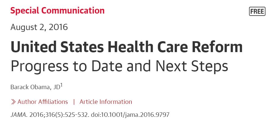
Let’s take a little jaunt through time to before the pandemic days (remember those?) and look at one of the most downloaded and cited articles in the history of the JAMA Network. Perhaps you’ll recognize the title (or, more likely, the author).

As you move toward the reference section of this article by our former president, you may notice that something looks a bit different about the first citation.

It’s subtle, but according to the newest edition of the AMA Manual of Style, 3.15.3, the location of the published and access dates now comes before the URL in electronic references, and there is no longer a period after the URL.

If President Obama’s article were published today, that reference would look like this:

  1. Centers for Medicare & Medicaid Services. National Health Expenditure Data: NHE tables. Published December 3, 2015. Accessed June 14, 2016. https://www.cms.gov/Research-Statistics-Data-and-Systems/Statistics-Trends-and-Reports/NationalHealthExpendData/NationalHealthAccountsHistorical.html

Just as access to health care is important, so is the access date in articles!

Updated Guidance on Reporting Race and Ethnicity: Let’s Start With the Why

Kim Penelton Campbell, BS, JAMA Network

I have used many adjectives to describe myself, but I’ve never referred to myself as other. When teachers called my name during morning attendance, I responded by saying “Here.” I never said, “Invisible.”

In medical literature, the failure to fairly and respectfully recognize and include individuals of all races and ethnicities can severely adversely affect patients’ lives and the quality of care they receive. It can misinform clinicians. It can compromise the credibility of a journal.

This means that race and ethnicity data should be reported in a way that encourages fairness, equity, consistency, and clarity in medical and science journals.1

Changing the b in Black and the w in White to uppercase lettering when describing race is not about mere political correctness—these changes are part of a conscientious movement toward equitable delivery of health care services to all people.

The objective of this post is to emphasize that updated guidance about the reporting of race and ethnicity is important, not because the AMA Manual of Style says so, but because inattentiveness to these changes can contribute to unconscious bias and ultimately affect how patients are treated or unintentionally mistreated.

Bias, when unintentional, is not mitigated—it remains bias all the same. Unintentional bias can occur simply because the writer or editor is removed from the patient’s life experience. When the writer or editor is unaware, they may not recognize how insensitive wording can affect the reader.

Example: “Adherence to the prescribed medication was higher among White patients than among Blacks.”

Consequence: Does this mean that if you are White you are a patient but if you are Black you are nothing? What is a Black?

When a person is called a Black instead of a Black patient or a patient who is Black, the wording detracts from that person’s humanity.

Likewise, use of lowercase lettering for Black and White, as well as referring to people as minorities instead of as members of a racial or ethnic minority group, also diminishes their humanity. Stating race or ethnicity in noun form can be interpreted pejoratively and is akin to labeling patients by their disease (eg, the blind, schizophrenics, epileptics) instead of putting the individual first (eg, a person with schizophrenia).2 Other things that can be interpreted pejoratively and should be avoided are using the term mixed race, which can carry negative connotations, instead of multiracial or multiethnic, merging race and ethnicity with a virgule (ie, race/ethnicity) rather than recognizing the numerous subcategories within race and ethnicity with the term race and ethnicity, and using abbreviations for racial and ethnic terms. Although the writer or manuscript editor may not have intended to negatively portray a group of people, the potential effect on readers remains unchanged.

  • To potential authors, the absence of a single word can indicate that a journal is insensitive to the health care needs of a population of patients.
  • To clinicians with the same racial or ethnic background as the one negatively represented, this can promote the inference that the journal has no diversity on its editorial board or staff.
  • To a practicing physician, this language can translate to offensive or insensitive communication when speaking with a patient or a patient’s family member.
  • To a patient, this wording can indicate that the medical community views individuals from their racial or ethnic group as nonpersons—unseen, unconsidered, and uncared for.
  • For all of these individuals, this can deepen a sense of mistrust.

Language that excludes a racial or ethnic group can subtly influence a medical trainee to “unsee” the humanity in people who are from a different background. If their research and educational sources are written or edited without intercultural competence, the medical trainee may unintentionally miscommunicate or make incorrect assumptions about patients from other backgrounds. This breach can interfere with a clinician’s understanding of the patient and, in response, impede the patient’s trust in the clinician.

Among some patients from communities that have been medically underserved or ignored, information about medical mistreatment can transcend generations. Past miscommunication can lead to mistrust, which can then lead to fear.

A family may never forget that Grandma never came home from the hospital and that no clinician took the time to explain why. Although this family was made to feel invisible because of miscommunication, it is quite possible that the clinician intended no disrespect and had no knowledge of how the family was affected. A patient with a historic burden of oppression can potentially interpret disrespectful communication as an initial step down the road to medical abuse.

My godfather once expressed such fear. He was Black, the clinicians were White, and he had grown up in Mississippi during the 1940s. Although I asked, he refused to ever repeat details of what was said by these physicians many years ago. But decades later, when I was a teenager and a novice driver, my godmother phoned and urgently asked that I come to their home immediately to rush him to our local VA hospital.

On my arrival, she exclaimed, “I think he had a heart attack while gardening in the back yard!” I said, “I’ll call 911. The ambulance will get him there faster.” Then, she stopped me. She pleaded that I drive him there myself. As I rushed to his aid, she continued by telling me that he would die of fear if an ambulance came to their home. She told me that I must speak for him when we arrived, remain by his side, and do everything in my power to keep him calm.

He cried like a baby during the entire ride. He was afraid. He was humiliated about expressing fear in my presence. I did not know what to say. I just kept driving. My heart was broken.

This brief story is an example of deep-seated fear that some Black people experience in a health care setting, a fear that can only begin to be abated with a conscientious effort to ensure that language humanizes Black patients and patients from all racial and ethnic backgrounds.

How does one address suboptimal reporting on race and ethnicity?

  • First, follow the guidelines.
  • Second, write and edit with a raised antenna. Look for what is unsaid in addition to what is written on the page.
  • Try to interpret as if you are a person from a racial or ethnic group unlike your own. Think about how you would you feel as the subject or nonsubject of the article.
  • Consider how wording can be misinterpreted.
  • Consider how inattentiveness to detail can affect the health, safety, or life of someone who is misrepresented.
  • Edit responsibly, but without fear of respectfully questioning the author.

Remember: no one is invisible, and no one is other.

“Not everything that is faced can be changed, but nothing can be changed unless it is faced.”3

James Baldwin

References

  1. Flanagin A, Frey T, Christiansen SL; AMA Manual of Style Committee. Updated guidance on the reporting of race and ethnicity in medical science journals. JAMA. 2021;326(7):621-627. doi:10.1001/jama.2021.13304
  2. Christiansen SL, Iverson C, Flanagin A, et al, eds. Correct and preferred usage. In: AMA Manual of Style: a Guide for Authors and Editors. 11th ed. Oxford University Press; 2020:547-548.
  3. Baldwin J. As much truth as one can bear. New York Times. January 14, 1962: Book review 1, 38. https://www.nytimes.com/1962/01/14/archives/as-much-truth-as-one-can-bear-to-speak-out-about-the-world-as-it-is.html

IQR You Serious?!

Amanda Ehrhardt, MA, JAMA Network

Compared with navigating the treacherous waters of causal language, or throwing down the proverbial gauntlet against the terms renal and mutation, upholding AMA Manual of Style rules regarding abbreviations and when to expand them may seem like Not That Big of a Deal. If you had to plot the interquartile range for feelings surrounding this task, it may go something like this:

The median response toward expanding an abbreviation was “Meh” (interquartile range, “Yuck!” to “Yay!”).

However, one of the beautiful things about style rules is that they evolve and adapt with changes in cultural and societal outlooks and the editing process, and they occasionally throw you a colorful floatie while you’re swimming in copy.

That interquartile range that I’ve mentioned several times now? Well, check out the Common Abbreviations and Expansions table in the updated version of 13.11.

That’s right, it’s IQR! From beginning to end! No expansion necessary anymore!

So perhaps we should reassess that statement from the beginning?

The median response to learning that IQR no longer needs to be expanded was “Woohoo!” (IQR, “Cool.” to “Best thing ever!”).

Mxed Messages

H Ford, they/them/theirs, Manuscript Editor, JAMA Network

There is a particular type of online pedant whose view of the English language has the effect of invalidating strangers’ sexual and gender identities. Much physical and digital ink has been spilled discussing the validity of the singular “they” when referring to a single gender-unknown subject of discussion and as an intentional personal pronoun.

I will not relitigate this issue here, but it should suffice that the AMA Manual of Style (sections 11.12.2 and 7.2.3.2, specifically) concurs with the Chicago Manual of Style, the AP Stylebook, and historical use (eg, Shakespeare and Emily Dickinson) in permitting the singular they.

Now with that said, let’s talk about respecting our queer friends, family, colleagues, and authors by using the honorific Mx! According to Merriam-Webster, the first use of the gender-neutral honorific Mx was in the 1970s, but its widespread use has only gained momentum within the past 5 to 10 years.

It can be helpful to compare Mx with Ms, another relatively recently developed honorific. Although the very first publication of the honorific Ms was in a 1901 article and was likely more focused on expediency of the address than the linguistic and sociopolitical ramifications of defining a woman by her social status, most people’s understanding of Ms is rooted in Gloria Steinem’s eponymous magazine (https://www.nytimes.com/2009/10/25/magazine/25FOB-onlanguage-t.html).

Mx is an honorific that affords the same respect to nonbinary and gender-nonconforming people that has traditionally been given to gender-conforming individuals who do not hold advanced degrees. As awareness grows of the existence of gender identities outside the male/female binary, more people every day feel comfortable publicly identifying as nonbinary, genderqueer, and agender.

The widespread use of Mx signals acknowledgment of and respect toward these individuals. Yet there is a broader application of the honorific Mx that we haven’t fully considered, one that is as practical as it is gender inclusive. Just as the title Ms allowed us to ask why a woman’s marital status affected how she was addressed, Mx should allow us to ask why a person’s gender should matter to any respectful form of address.

For these reasons, JAMA Network now offers Mx as a salutation for submissions to all of its journals!

As editors and writers, we occupy a unique position in the process of the legitimization of nascent linguistic terms. Let’s use that power for good!

Social Media: Dos and Don’ts

Eman Hassaballa Aly, Social Media Manager; Reuben Rios, Social Media Coordinator; Deanna Bellandi, MPH, Manager, Media Relations (JAMA Network)

“All we want are the facts.”

Sgt Joe Friday, Dragnet

Social media is an important tool for promoting content published in JAMA and the JAMA Network family of journals to the research community, physicians and other health professionals, and lay audiences. Doing that means following a set of guidelines meant to ensure accurate and responsible social media posts.

JAMA Network Social Media Guidelines

  • Content published in social media sites is subject to the same norms, standards, and regulations as is all other published content.1
  • Be respectful.2
  • Use proper grammar, spelling, and capitalization.3
  • Abbreviations may be used provided they can be easily understood in context.
  • Avoid texting jargon, such as “U” for “you” or “L8” for “late.”3
  • Do not use sarcasm, irony, satire, or absurdities.4
  • Reflect diversity.4
  • Use language that is nondiscriminatory.5
  • Do not include negative comments directed at any person, group, or institution.
  • Do not use offensive content (including, but not limited to, racist, sexist, ageist, anti-LGBTQ, and antireligious.)6
  • Do not include sexually suggestive images or video (eg, genitalia, breasts, buttocks) or those that portray sexual assault/abuse.
  • Do not use language, images, or other content that reinforces stereotypes.5
  • Use individuals’ preferred pronouns when known; inclusive pronouns (they/them) are acceptable.4,5
  • When reporting the results of a study or describing a specific journal article, replace personal pronouns (I and we found) with reference to the study or the article type (eg, Viewpoint, Review).
  • When mentioning people/Twitter handles, do not editorialize or designate appellations (eg, do not say, “The great [@Twitter handle] discusses…”).
  • Do not use profanity or vulgarity.2,6
  • Do not include emojis based on gender or race.4
  • Do not include identifiable patient content without permission.1
  • Do not share confidential information.7
  • Do not share information that is embargoed or before publication date and time.
  • Do not include quotes, images, photos, or video from other social networking sites or third-party publications without permission and attribution to the source.8
  • Do not share others’ social media posts that do not follow these guidelines.
  • Correct posts with errors transparently and as soon as possible. For example, add a new post clarifying the correction, and include the word “correction.”

Posts that do not follow these guidelines may be removed.

Tweet Formatting

  • The basic format of a tweet consists of text, links, and hashtags handles with optional attached video and images (up to 4 images per tweet).
  • Length: the maximum length for JAMA Network tweets is 257 characters. Twitter limits to 280 characters, but because JAMA Network always includes a link, 23 characters are reserved for the link.
  • Hashtags should be limited to 3 per tweet.
  • Twitter handles should be included if there is room. Handles should be limited to authors and institutions directly related to the content of the tweet.
    • Example: Tweet text (including relevant @mentions and #hashtags), Link, Other @mentions (if not directly mentioned in the tweet), Other hashtags (if any, and if space permits).

References

  1. Christiansen C, Iverson C, Flanagin A, et al. 5.9.5. Social Media and 5.11.19 Social Media. In AMA Manual of Style: A Guide for Authors and Editors. Accessed March 24, 2021. https://www.amamanualofstyle.com/view/10.1093/jama/9780190246556.001.0001/med-9780190246556-chapter-5-div2-230
  2. Grossmont-Cuyamaca Community College District. Social Media Guidelines. Accessed April 2, 2021. https://www.gcccd.edu/marketing-communications/social-media-guidelines.html
  3. Christiansen C, Iverson C, Flanagin A, et al. 7.11. Grammar in Social Media. In AMA Manual of Style: A Guide for Authors and Editors. Accessed March 24, 2021. https://www.amamanualofstyle.com/view/10.1093/jama/9780190246556.001.0001/med-9780190246556-chapter-7-div1-138
  4. Sehl K. How to Create Effective Social Media Guidelines for Your Business. Hootsuite. Blog. February 3, 2020. Accessed April 2, 2021. https://blog.hootsuite.com/social-media-guidelines/
  5. United Nations. Guidelines for gender-inclusive language in English. Accessed April 2, 2021. https://www.un.org/en/gender-inclusive-language/guidelines.shtml
  6. CollegeGrad. 10 Things You Should Never Post on Social Media. Accessed April 2, 2021. https://collegegrad.com/blog/10-things-you-should-never-post-on-social-media
  7. Storey V. Social Media Guidelines or Policy?  Social Media Today. May 17, 2011. Accessed April 2, 2021. https://www.socialmediatoday.com/news/social-media-guidelines-or-policy/475646/
  8. Associated Press. Social Media Guidelines for AP Employees. Revised May 2013. Accessed March 24, 2021.  https://www.ap.org/assets/documents/social-media-guidelines_tcm28-9832.pdf

JAMA Network Guidance on Venn Diagrams

Connie Manno, ELS, Director, Freelance Editing Unit, JAMA Network

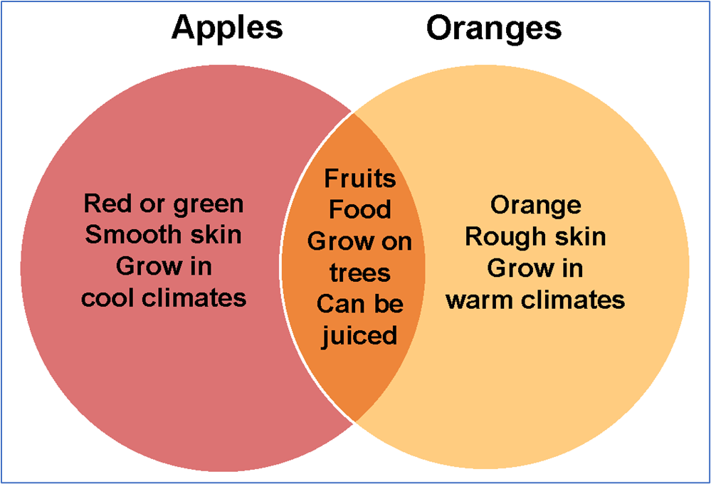
Venn diagrams are simple pictorial representations of relationships that exist between 2 or more sets of things. Circles that overlap have commonality; circles that do not overlap do not share traits.1

Although Venn diagrams represent conceptual shared or unique traits between separate ideas or groups of things (Figure 1), they are not appropriate to visualize numerical (empirical) data.2

Figure 1. Conceptual Venn Diagram

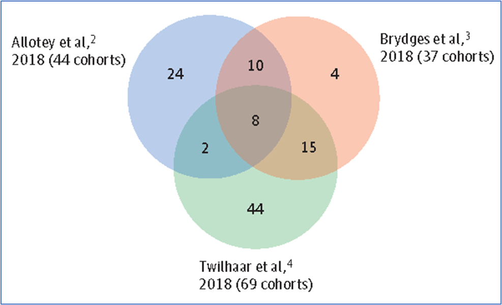
Often, the separate sets are presented as identically sized circles—even if the quantities in each set and the overlapping and nonoverlapping segments are different—and the resulting illustration can be not only imprecise but also misleading (Figure 2).3

Figure 2. Venn Diagram of Identically Sized Circles That Represent Different Quantities

The identically sized circles obscure the different numbers of cohorts included in the referenced studies. From Sentenac et al.3

Like pie charts, which also compare relationships among component parts and are frequently used to depict data for a lay audience, Venn diagrams should be avoided in scientific publications.4(pp137-138)

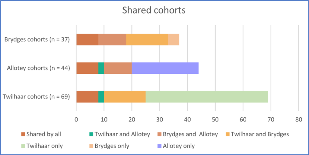
One more precise way to present the data is to create a bar graph or component bar graph (Figure 3), which can present the relationships between 2 or more data sets while illustrating the size difference between the sets with bars of unequal lengths. A component bar graph additionally uses color and section length to highlight patterns in the data.2

Figure 3. Data as a Component Bar Graph

When the data from Figure 2 are presented as a component bar graph, the difference in cohort sizes is apparent from the bar lengths. In addition, bar sections that depict shared segments use the same color.

Another option is to present the data in a matrix: a tabular structure that uses numbers, short words (eg, no, yes), symbols (eg, bullets, check marks), or shading to depict relationships among items in columns and rows and to allow comparisons among entries.4(p114)

Depending on the complexity of the construction and the need for multiple colors or shading, a matrix may be presented as a table or figure (Figure 4).

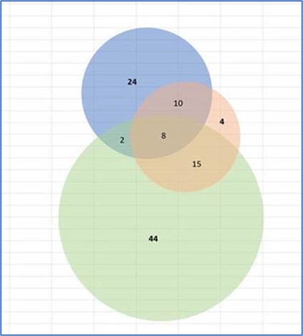
A third option is to resize the circles to make them more proportional to the quantities they represent (Figure 5), but only if the circles and overlaps are precise and generated from statistical software.

Figure 5. Circles From Figure 2 Resized to More Accurately Represent the Sample Sizes

This option must use precisely sized circles and overlaps generated from statistical software to ensure that the figure’s elements are truly proportional.

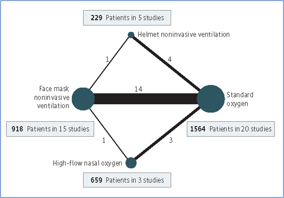
Network figures that use nodes and connecting lines of varying sizes to illustrate the proportions of the compared items are also useful for depicting relationships among 2 or more sets of data (Figure 6).5

Figure 6. Network Figure Depicting Relationships Among 4 Data Sets

In this network map, the size of the nodes is proportional to the number of participants in each node, and the thickness of the connecting lines is proportional to the number of randomized clinical trials in each comparison. From Ferreyro et al.5

Although data can be displayed multiple ways, accuracy and audience, as well as the criteria of the final format (eg, scientific journal vs consumer publication), should govern the decision of which option to use.

References

  1. Kenton W. Venn diagram. Investopedia website. Updated January 17, 2020. Accessed February 1, 2021. https://www.investopedia.com/terms/v/venn-diagram.asp
  2. Harris RM. Bar plots as Venn diagram alternatives. Rayna M. Harris blog. May 7, 2019. Accessed February 1, 2021. https://www.raynamharris.com/blog/vennbar/
  3. Sentenac M, Boutron I, Draper ES, et al. Defining very preterm populations for systematic reviews with meta-analyses. JAMA Pediatr. 2020;174(10):997-999. doi:10.1001/jamapediatrics.2020.0956
  4. Tables, figures, and multimedia. In: Christiansen S, Iverson C, Flanagin A, et al. AMA Manual of Style: A Guide for Authors and Editors. 11th ed. Oxford University Press; 2020:113-169.
  5. Ferreyro BL, Angriman F, Munshi L, et al. Association of noninvasive oxygenation strategies with all-cause mortality in adults with acute hypoxemic respiratory failure: a systematic review and meta-analysis. JAMA. 2020;324(1):57-67. doi:10.1001/jama.2020.9524